I really like some of the simpler whimsical images from The sailing Pineapple. Here is my tag for this weeks tag challenge :
The flower is colored with copics, prisma color pencils and Faber Castell india ink pens. White highlights added and then the flower was fussy cut.
The background is dylusions sprays in red and black, white ink through a stencil, then white splatter with acylic paint. Embellished with green washi tape and bakers twine.
I loved the simple sentiment, create. I certainly had fun creating this. If I dont walk away from a crafting session with at least 5 ink stains on my hands I am disappointed .... LOL. I love turning a simple image into something, adding depth and color.
Thank you for stopping by today, go and check out the tag challenge on The Sailing Pineapple blog.
Welcome to my creative adventures, my quirky little corner of fun and sanity !
Showing posts with label The Sailing Pineapple. Show all posts
Tuesday, November 4, 2014
Friday, October 24, 2014
Sailing Pineapple - Lizzy Love Blog hop
Hello hoppers :)
If you find yourself here, you have possibly come from Ilaria's blog, welcome :)
Lizzy Love images are so great aren't they, The Sailing Pineapple sell the rubber stamps by Lizzy Love, there are LOTS to choose from. The stamped images are approximately 3.25" high.
I hope you have enjoyed the Halloween theme of this hop. For the hop finale, I have used the super cool Frankenstein image, image #92 if you visit the store :).
This quote is from Young Frankenstein. It is actually pretty long, so I shortened it, but you get the idea (whole quote is at the end fyi). It works so well with the image, dont you think ? I stamped the letters individually from an alphabet stamp set I have. My mixed media background is made with Dylusions sprays in blue, lime green and orange with salt added for that spotty/grain affect. I added a layer of white dylusions over the top to lighten it all up. I doodled around the edges in white gel pen and added a Halloween washi-tape pedestal for Frankenstein. The bats are dollar store plastic embellishment.
Frankenstein was colored with copics. I actually have about 25 copics, so if you ever need to know the colors I used, please ask, it is fairly easy for me to rediscover with my limited selection :) I added two coats of clear embossing powder to him and popped him up. He looks pretty great I think :)
Hope you enjoyed the inspiration here, now we have a great offer for you :
We are offering 35% off all Lizzy Love stamps Oct 25-27 (Saturday through Monday), and if you buy 4 or more Lizzy Love stamps, you get a FREE digital image from Lizzy, so head to the store and pick up some great stamps :)
And leave some love on everyones blogs for a chance to win a Lizzy Love rubber stamps :) Winner to be announced on the Sailing Pineapple blog on Monday 27 October :)
Here are the blog links for the hop, incase you want to go back and look at anything :
The Sailing Pineapple- http:// sailingpineapple.blogspot.com
Vikki- http://tspvikki.blogspot.com
Ilaria - http://ilascrappa.blogspot.com
Nikki x
Whole quote from Young Frankenstein :
"After many years of observation, multiple hypothesis, well structured analysis, and deeply reviewed interpretations .... I've FINALLY come to the conclusion : I'm NOT normal!"
Whole quote from Young Frankenstein :
"After many years of observation, multiple hypothesis, well structured analysis, and deeply reviewed interpretations .... I've FINALLY come to the conclusion : I'm NOT normal!"
Tuesday, October 21, 2014
Newsprint/Wording/Sentiment/quotation challenge
Making a project using the gorgeous image from Lizzy Love, for sale through The Sailing Pineapple.
For this sentiment, I actually copied a few lines from a dictionary, printed it out and tore and lightly sponged the edges. Lots of people get totally engrossed in a book, transported or escaping to another time and place - ok, my hands are up ..... guillty as charged ? LOL
Thanks for stopping by x Nikki
Monday, October 6, 2014
Star Hobbit Easel Card
This is an interesting image from The Sailing Pineapple, Star Hobbit. The crazy hair could give her a frazzled look, a cut look etc. Quite versatile to color. I made a round easel card with her as my centre piece.
I colored her with copics, water based ink marker and white gel pen. I used Spellbinders circles and lacy circles to die cut the shapes. The sentiment was so cute.
Its interesting with Star Hobbits eyes, I feel like they follow you, see ....
Thanks for visiting :)
Monday, September 29, 2014
Halloween Humour
You know sometimes things are all so serious, and other times you just fancy something light hearted and humorous ... well I had such a feeling in connection to a Halloween creation ... See what I mean ? LOL
This postcard was so much fun to create, I gesso'd my mixed media paper, thick lumpy gesso at the top for some texture, then when it was dry (finger tapping waiting ... impatient etc LOL) I used dylusions sprays. I resized the the digi images from The Sailing Pineapple , witch legs and zentangle tree from the angle bird paradise set. The images were colored with copics and prisma pencils. I added white detailing to the tree, then shading all around the images and background with a graphite pencil and blending stub. 'BEWARE' was cut out with a Sizzix alphabet die, the 'low flying witch' was stamped with an alphabet set in stazon.
Now that was fun. I have no idea if there is any significance or hidden meaning to the words, I really dont think there is ... other than I had a few hours of orange, green and purple escapism ....
Thanks for stopping by x
Tuesday, September 23, 2014
Flip Flop Junkie
I made this cute card for The Sailing Pineapple challenge, My Favourite Things.
I love the summer, when you can just get up and go, in flip flops and shorts etc. Winter is soooo much more complicated here in Canada ! As the summer comes to an end, thought I'd celebrate the freedom of the flip flop .... LOL
This is a mixed media project, the background is made with gelatos and white embossing for the spots and words. I wanted to give the flip flops an old and worn look, so I messily (is that a word ? LOL) gesso'd them first. When it was dry I colored them with gelatos, and lightly sanded them. You can see the texture of the gesso showing through. I used my inktense pencils to do the blue detailing, and pinched and scrunched up flowers for the fancy toe pieces. Adding glimmer brads. Here is a close up :
Thanks for stopping by :)
Sunday, September 14, 2014
The Sailing Pineapple Blog Hop
The title of this blog hop is Anything Goes, and I have used one of the stamps for sale through The Sailing Pineapple, by Mary Ellen Smith.
Such a cute image to work with, and perfect for a kids Birthday card.
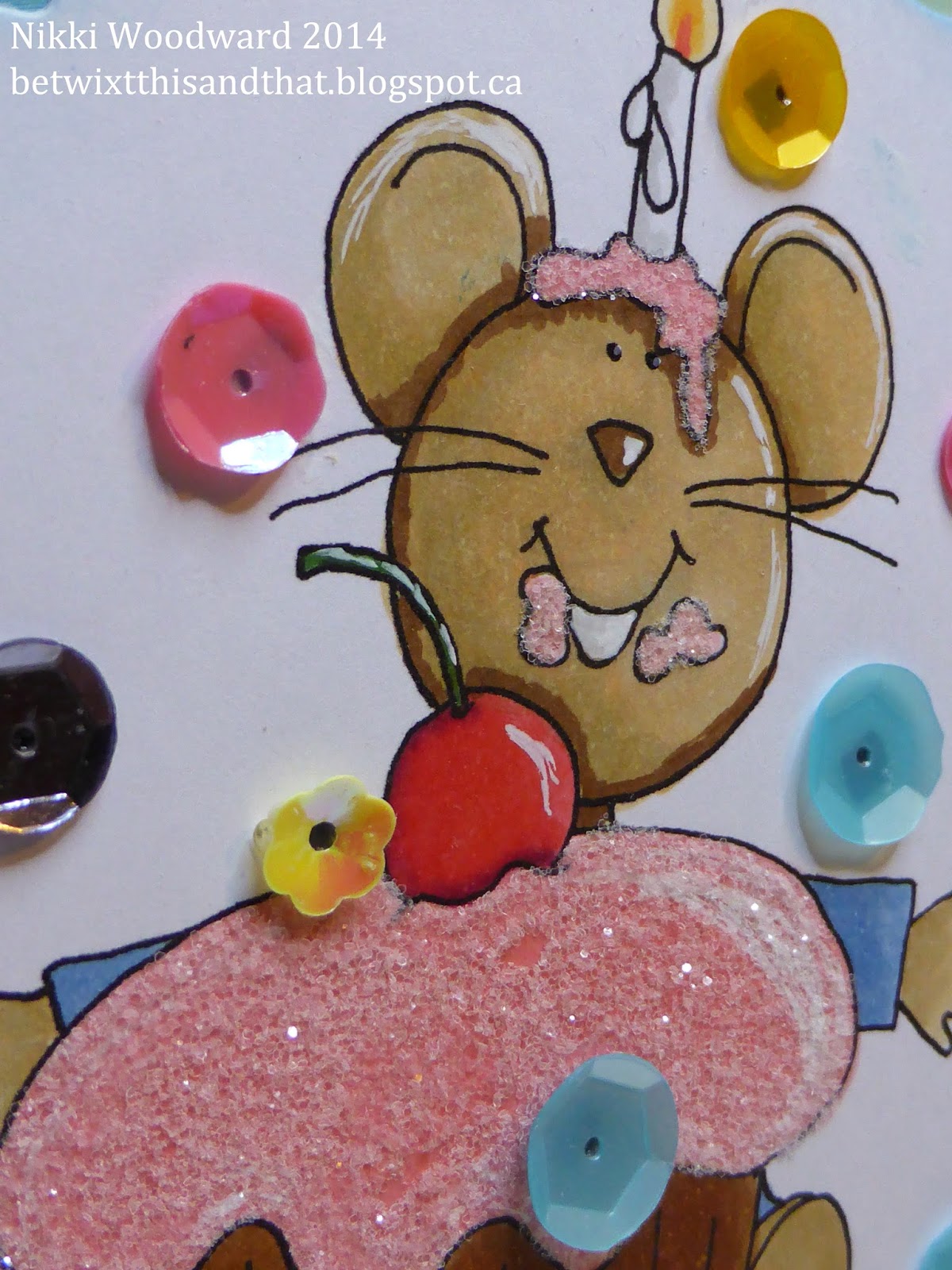
The image is colored with copics, and I added sparkle to the cupcake. Every cupcake is deserving of some sort of sparkle in my opinion. Yum, looks good enough to eat ...
Before you carry on your journey by hopping over to Traceys blog, I will explain a few prizes you can win ...
By commenting on this blog post, you will be in the draw to win one of my favourite TSP images, Oscar the cat, so leave me a comment - good luck :)
There is also a $15 Store voucher for digital images, which will be randomly drawn from comments left on the Blog Hop post at The Sailing Pineapple Blog.
All the winners will be announced on TSP Blog on October 5th
Saturday, September 13, 2014
Birthday cake surprise
For a Birthday party recently, I did a simple and slightly alternative take on money in a card ... Used an image from The Sailing Pineapple, resized to accomodate the $.
It was a quandary how to attach the $, so I actually sewed loops and threaded the money in :)
Thanks for visiting :)
Tuesday, August 12, 2014
Flip Flop ...
Made a postcard for the summer challenge at The Sailing Pineapple blog this week :
The background was made by coloring various colors of Paper Artsy chalk acrylics randomly. When it dried I covered the whole thing in paynes grey acrylic paint. I splashed water onto it, waited until the unwatered grey was dry and used a baby wipe to remove the watered parts. The water stops the paint from drying ... Thanks Andy Skinner for that technique :)
I printed the flip flops on my printer, colored them with inktense pencils, embossed them in clear powder and cut them out. Flowers and brads were added.
I used individual letter stamps to stamp the sentiment, cut it out and doodled around them words to match the doodled edge of the flip flops.
This is another page in my optimist / positive affirmation book :)
Thanks for visiting, please leave me a comment :)
Nikki x
Wednesday, August 6, 2014
TSP 14, Bingo Challenge
Well I have to admit that I have never done a bingo challenge before, but I liked it .... The Sailing Pineapple hallenge this week :)
Here are my atc's :
I resized the flower image for atc's, printed them and colored with my inktense and prisma pencils. I printed additional flowers and popped those up to add dimension. The little bee is a sticker and I added splatters to the background and co-ordinating patterned paper.
Thanks for stopping by, please leave a comment :)
Here are my atc's :
I resized the flower image for atc's, printed them and colored with my inktense and prisma pencils. I printed additional flowers and popped those up to add dimension. The little bee is a sticker and I added splatters to the background and co-ordinating patterned paper.
Thanks for stopping by, please leave a comment :)
Thursday, July 31, 2014
Glitz and Glamour - TSP Challenge #13
I really struggled this week with this challenge at The Sailing Pineapple. I didn't really have an image that jumped out at me and said Glitz and Glamour .... so I improvised :) I used iridescent ice embossing power to make my posh poodles shine. A LOT of little detailed fussy cutting went on here .... LOL. I printed the sentiment from my computer.
Tuesday, July 22, 2014
Christmas in July ... TSP week 11
There was a Christmas in July challenge on The Sailing Pineapple Blog, so I made another page for my positive affirmation / sayings book : Wish Everyday was Christmas.
To make the background : I adhered triangular pattered paper, intended to simulate Christmas trees. Then I colored extra thick gel medium with red acrylic paint and painted it onto the background in swirly patterns with a hard bristle brush. When it was dry I doodled the circles and ornament shapes. Adding some white gel pen for highlights and a few glimmer brads. I stamped messy white snowflakes in the background too - used my Dylusions stamping pad for the first time for this - I sprayed the white into the empty stamp pad. Saw Dyan Reaveley do that. It worked out well, gives a scattered look, but the background is very textured with ridges from the gel medium. I edged the whole thing in a red artist big brush pen, smudging with my fingers.
For the main image : In 'word' I made the cat the desired size and printed him onto pale grey card stock*. I colored him with my copics markers, a lighter and darker green. Then I took my blending tool and some alcohol ink blending solution and just pounced lightly over the top of the cat. It gives a really cool mottled look.
The cat was fussy cut, a Christmas hat was made from tissue paper and a bell added to his tail. He was popped up with dimensional tape. Doesn't he look funky in his shade of green :)
For the wording I used a combination of Tim's words from a word stack, my own handwriting and a sticker ....
I had an awesome time creating and having fun with this project, in the heat we are having here, thinking about the coolness and festivities of Christmas .... lol.
I hope you like it and got inspired - enough to leave a comment ? LOL
*My new favourite paper/card to print digital images onto is pale colored card stock, there are a couple of reasons for this. I have an inkjet printer and often if I print onto white, smooth cardstock the image will easily smudge or react with whatever product I use over it, to color it etc. Many colored card stocks are more absorbent, meaning there is no need to seal the image and it dries much faster. Secondly, colored card stock is often thicker than white, so when I pop up my image it is stronger and remains flat. A good comparison here is Stampin' Up! whisper white compared to a pale subtles color. It has taken me some time to move away from using the traditional white as the stamping base, but I am going to color the image with a variety of mediums anyway, so really it doesn't matter what color I start with :)
To make the background : I adhered triangular pattered paper, intended to simulate Christmas trees. Then I colored extra thick gel medium with red acrylic paint and painted it onto the background in swirly patterns with a hard bristle brush. When it was dry I doodled the circles and ornament shapes. Adding some white gel pen for highlights and a few glimmer brads. I stamped messy white snowflakes in the background too - used my Dylusions stamping pad for the first time for this - I sprayed the white into the empty stamp pad. Saw Dyan Reaveley do that. It worked out well, gives a scattered look, but the background is very textured with ridges from the gel medium. I edged the whole thing in a red artist big brush pen, smudging with my fingers.
For the main image : In 'word' I made the cat the desired size and printed him onto pale grey card stock*. I colored him with my copics markers, a lighter and darker green. Then I took my blending tool and some alcohol ink blending solution and just pounced lightly over the top of the cat. It gives a really cool mottled look.
The cat was fussy cut, a Christmas hat was made from tissue paper and a bell added to his tail. He was popped up with dimensional tape. Doesn't he look funky in his shade of green :)For the wording I used a combination of Tim's words from a word stack, my own handwriting and a sticker ....
I had an awesome time creating and having fun with this project, in the heat we are having here, thinking about the coolness and festivities of Christmas .... lol.
I hope you like it and got inspired - enough to leave a comment ? LOL
*My new favourite paper/card to print digital images onto is pale colored card stock, there are a couple of reasons for this. I have an inkjet printer and often if I print onto white, smooth cardstock the image will easily smudge or react with whatever product I use over it, to color it etc. Many colored card stocks are more absorbent, meaning there is no need to seal the image and it dries much faster. Secondly, colored card stock is often thicker than white, so when I pop up my image it is stronger and remains flat. A good comparison here is Stampin' Up! whisper white compared to a pale subtles color. It has taken me some time to move away from using the traditional white as the stamping base, but I am going to color the image with a variety of mediums anyway, so really it doesn't matter what color I start with :)
Wednesday, July 16, 2014
Anything goes challenge - TSP Week 10
So I could make anything this week for the challenge on The Sailing Pineapple blog ... so long as it wasn't a card. I decided on a bookmark using a flower background stamp. I put the image into word and changed all the aspect ratios to get a more elongated shape - suitable for a bookmark :) I really do like to versatility of digital images ...
I printed the image onto pale grey card stock, then colored with my inktense pencils. I actually further cut down the image so it flowed outside of the edges of the bookmark. I doodled around the edge and then ran it through the laminating sheets with my Xyron. Gosh that thing is so cool ... and now my bookmark is super durable. I added co-ordinating ribbons and taaaadaaar ..... completed bookmark :)
Thanks for visiting, please leave a comment :)
I printed the image onto pale grey card stock, then colored with my inktense pencils. I actually further cut down the image so it flowed outside of the edges of the bookmark. I doodled around the edge and then ran it through the laminating sheets with my Xyron. Gosh that thing is so cool ... and now my bookmark is super durable. I added co-ordinating ribbons and taaaadaaar ..... completed bookmark :)
Thanks for visiting, please leave a comment :)
Tuesday, July 1, 2014
Sew Happy in your new home ... TSP - sewing challenge Week 9
Fun this week painting mushroom type houses with my new inktense pencils .... for The Sailing Pineapply sew it challenge. There is faux stitching around the image and a little X stitch in the top left and bottom right.
After printing the image from my computer, I did actually coat it in a thin layer of clear gesso. I was using regular white Stampin' Up! whisper white cardstock. I did not want the colors to absorb into the paper, but stay vibrant ontop of the gesso. And besides, I loooove the scratchiness of clear gesso.
The background was made using the bargello quilting technique. I used a variety of papers and a thin coat of gesso to subdue them a little as they were pretty stark colors. I added some splatters of white too :)
There is a really cool pair of flip flops as a freebie this week at The Sailing Pineapple blog, maybe take a look and play along .... sailingpineapple.blogspot.ca/2014/07/challenge-no-9-sew-cute.html
Thanks for visiting, hope you found some inspiration here, if so please leave a comment :)
After printing the image from my computer, I did actually coat it in a thin layer of clear gesso. I was using regular white Stampin' Up! whisper white cardstock. I did not want the colors to absorb into the paper, but stay vibrant ontop of the gesso. And besides, I loooove the scratchiness of clear gesso.
The background was made using the bargello quilting technique. I used a variety of papers and a thin coat of gesso to subdue them a little as they were pretty stark colors. I added some splatters of white too :)
There is a really cool pair of flip flops as a freebie this week at The Sailing Pineapple blog, maybe take a look and play along .... sailingpineapple.blogspot.ca/2014/07/challenge-no-9-sew-cute.html
Thanks for visiting, hope you found some inspiration here, if so please leave a comment :)
Tuesday, June 24, 2014
Just Keep Swimming : TSP - recycling challenge week 8
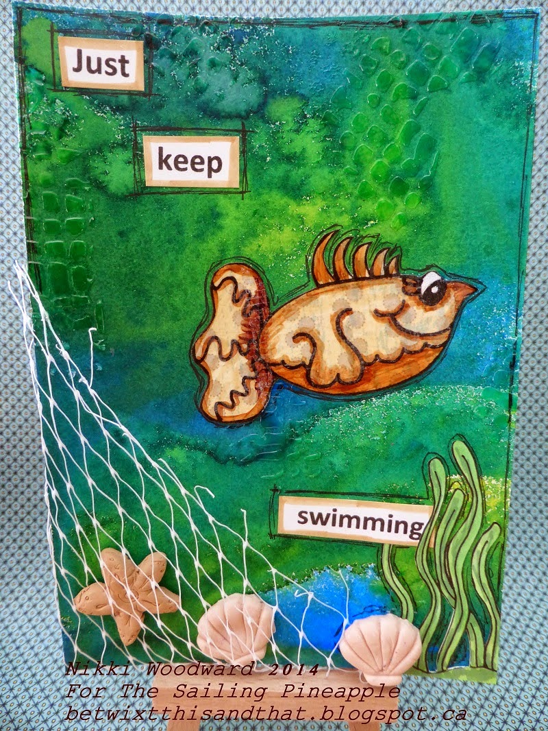
So the challenge at The Sailing Pineapple (TSP) this week was to make a project using recycled materials. We just finished a large pack of baby bell cheese in our house, and I spied a fish net opportunity ... LOL I used Under the Sea digital stamps.
So many techniques and products in this little postcard ...
The background is created with Dylusions sprays and I used translucent moulding paste through a stencil. I made the shells and starfish from Sculpey clay and the net is from a baby bell wrapper. The plants were printed, colored with copics and fussy cut. The fish was paper pieced onto spotty paper.
I did this by printing the fish onto cheap copy paper, then cutting a piece of patterned paper and adhering it over the top with temporary tape. I then put that sheet back into my printer, and it printed the fish in exactly the same place :) Cool or what .... There are so many little tips and tricks with digi stamps, you just have to try things out and read blogs like this to get the 'aha' moment.... lol
I then covered the fish in translucent moulding paste. When it was dry I colored with my copics and fussy cut, and I used a black artist pit pen to add some detail to and around the fish and page. The fish feels so lovely to the touch, its glossy and smooth.
The sentiment is obviously from 'Finding Nemo', but the significance in this postcard is to not get caught up and to just keep moving forward, regardless of whats going on :) I am actually putting together a postcard book of positive affirmations and meaningful (to me) sentiments - just like this. The postcards are 6x4.25" and I will bind them all together at the end.
Thanks for visiting, I hope you find some inspiration here.
Please leave a comment and subscribe to my blog x
So many techniques and products in this little postcard ...
The background is created with Dylusions sprays and I used translucent moulding paste through a stencil. I made the shells and starfish from Sculpey clay and the net is from a baby bell wrapper. The plants were printed, colored with copics and fussy cut. The fish was paper pieced onto spotty paper.
I did this by printing the fish onto cheap copy paper, then cutting a piece of patterned paper and adhering it over the top with temporary tape. I then put that sheet back into my printer, and it printed the fish in exactly the same place :) Cool or what .... There are so many little tips and tricks with digi stamps, you just have to try things out and read blogs like this to get the 'aha' moment.... lol
I then covered the fish in translucent moulding paste. When it was dry I colored with my copics and fussy cut, and I used a black artist pit pen to add some detail to and around the fish and page. The fish feels so lovely to the touch, its glossy and smooth.
The sentiment is obviously from 'Finding Nemo', but the significance in this postcard is to not get caught up and to just keep moving forward, regardless of whats going on :) I am actually putting together a postcard book of positive affirmations and meaningful (to me) sentiments - just like this. The postcards are 6x4.25" and I will bind them all together at the end.
Thanks for visiting, I hope you find some inspiration here.
Please leave a comment and subscribe to my blog x
Tuesday, June 17, 2014
Bee You - TSP - Color Challenge No 7
There is a color challenge this week over on The Sailing Pineapple blog and here is my first design team submission :) The colors in the challenge are so fresh, it brightened my day to make this postcard, using the free bee digital image from the week 5 challenge. I love the zentangle look of this bee.
The background is done in distress inks, then I used a stencil to spritz water onto it to remove a little of the color - you can lightly see the flowery pattern in the background. I sponged the edges and added some crackle glaze. The bee is colored with a combination of gelatos and ink, and detail added with pencil and white acrylic. Because the bee was cut out and the wings are free, I decided not to cut out the antennae. Instead I traced them and then drew them in. The sentiment and sequins add a little more fun detail.
For more info about the challenge and to get a free digital image go to : http://sailingpineapple.blogspot.ca/2014/06/challenge-no-7-colour-pallette-design.html
Have a fun day x
The background is done in distress inks, then I used a stencil to spritz water onto it to remove a little of the color - you can lightly see the flowery pattern in the background. I sponged the edges and added some crackle glaze. The bee is colored with a combination of gelatos and ink, and detail added with pencil and white acrylic. Because the bee was cut out and the wings are free, I decided not to cut out the antennae. Instead I traced them and then drew them in. The sentiment and sequins add a little more fun detail.
Have a fun day x
Subscribe to:
Posts (Atom)