Tuesday, June 24, 2014

Just Keep Swimming : TSP - recycling challenge week 8

So the challenge at The Sailing Pineapple (TSP) this week was to make a project using recycled materials. We just finished a large pack of baby bell cheese in our house, and I spied a fish net opportunity ... LOL I used Under the Sea digital stamps.
So many techniques and products in this little postcard ...

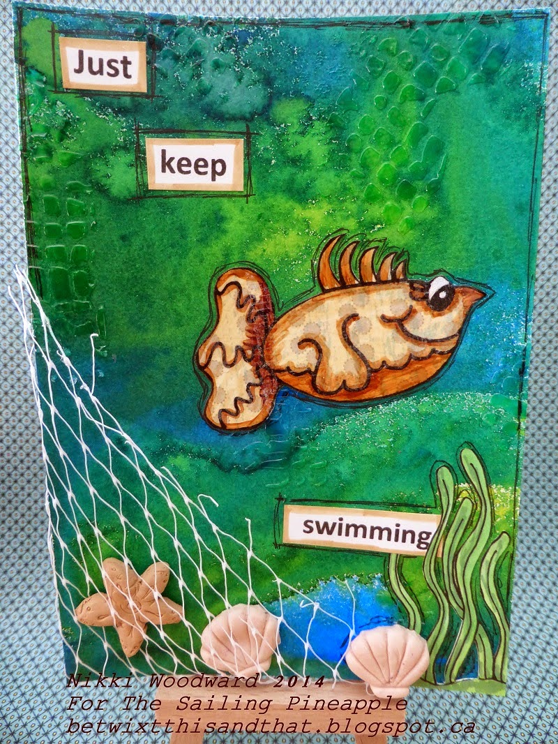
The background is created with Dylusions sprays and I used translucent moulding paste through a stencil. I made the shells and starfish from Sculpey clay and the net is from a baby bell wrapper. The plants were printed, colored with copics and fussy cut. The fish was paper pieced onto spotty paper.

I did this by printing the fish onto cheap copy paper, then cutting a piece of patterned paper and adhering it over the top with temporary tape. I then put that sheet back into my printer, and it printed the fish in exactly the same place :) Cool or what .... There are so many little tips and tricks with digi stamps, you just have to try things out and read blogs like this to get the 'aha' moment.... lol

I then covered the fish in translucent moulding paste. When it was dry I colored with my copics and fussy cut, and I used a black artist pit pen to add some detail to and around the fish and page. The fish feels so lovely to the touch, its glossy and smooth.

The sentiment is obviously from 'Finding Nemo', but the significance in this postcard is to not get caught up and to just keep moving forward, regardless of whats going on :) I am actually putting together a postcard book of positive affirmations and meaningful (to me) sentiments - just like this. The postcards are 6x4.25" and I will bind them all together at the end.

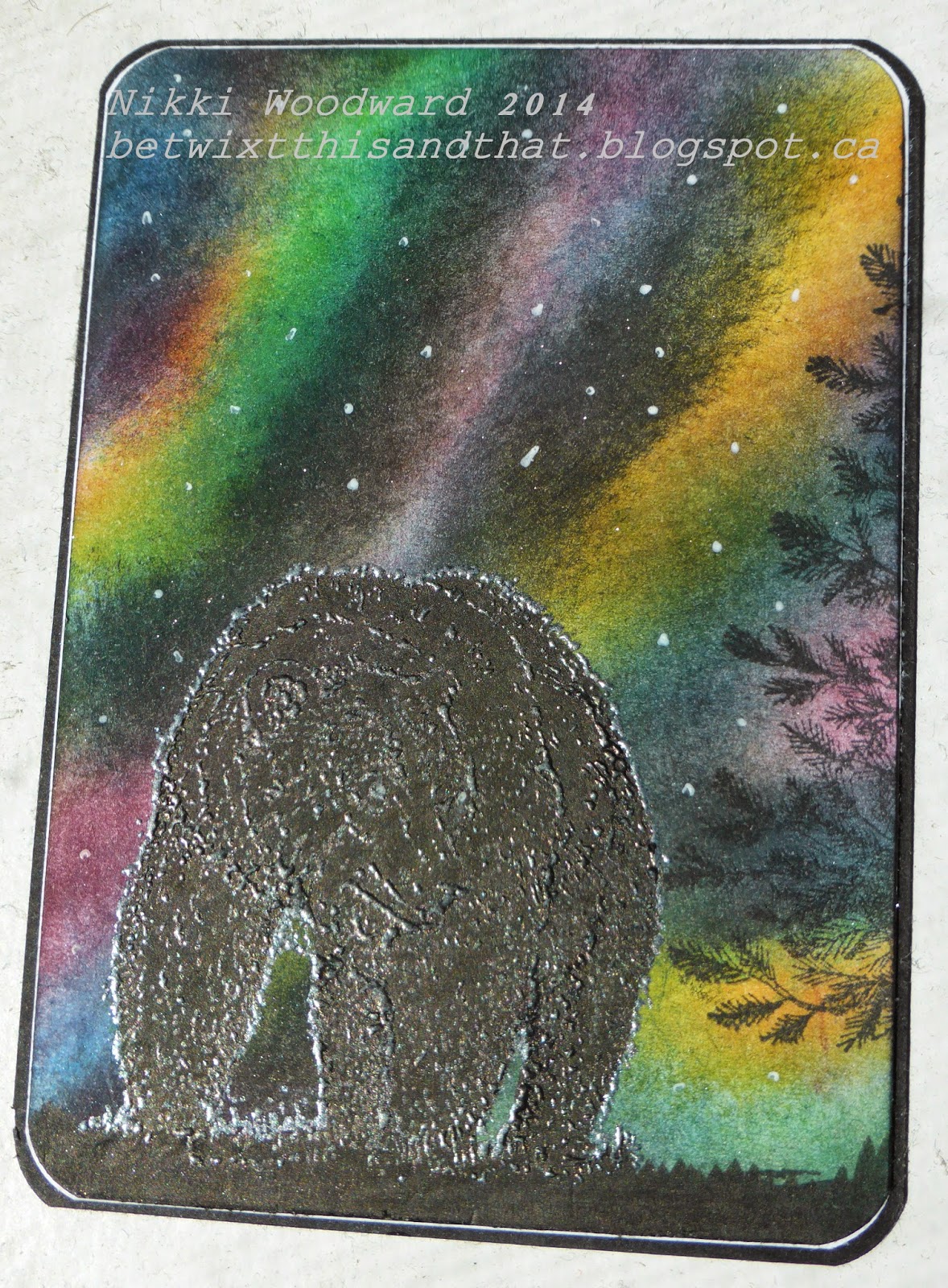
Thanks for visiting, I hope you find some inspiration here.
Please leave a comment and subscribe to my blog x

Tuesday, June 17, 2014

Bee You - TSP - Color Challenge No 7

There is a color challenge this week over on The Sailing Pineapple blog and here is my first design team submission :) The colors in the challenge are so fresh, it brightened my day to make this postcard, using the free bee digital image from the week 5 challenge. I love the zentangle look of this bee.
The background is done in distress inks, then I used a stencil to spritz water onto it to remove a little of the color - you can lightly see the flowery pattern in the background. I sponged the edges and added some crackle glaze. The bee is colored with a combination of gelatos and ink, and detail added with pencil and white acrylic. Because the bee was cut out and the wings are free, I decided not to cut out the antennae. Instead I traced them and then drew them in. The sentiment and sequins add a little more fun detail.

For more info about the challenge and to get a free digital image go to : http://sailingpineapple.blogspot.ca/2014/06/challenge-no-7-colour-pallette-design.html

Have a fun day x

Monday, June 16, 2014

Punch template

A friend showed me this idea recently, thanks Sue Revill .... and I thought I would post it on here as its such a great idea, both to check which is the best punch for your sentiment to fit on, but also some stamps seen through a punched shape take on a whole different look.  Give it a try, its really useful.

Sunday, June 15, 2014

Art journalling .... Hope you like it .... duh !

A few times recently I have added at the end of my art journal/mixed media blog posts, "I hope you like it". Also, when at events people come around perusing others work etc, and we feel the need to explain and secretly hope they'll like what we are pouring our time and emotions into. But you know, really it doesn't matter. Mixed media and art journalling is such a personal journey. For me it is akin to therapy, a place I can safely process and depict my thoughts. So I may change my 'hope you like it', to 'hope you find some inspiration' - meaning both artistically and also emotionally. Thanks for listening ... here ends the sermon x

Age journal page

Purple overload ..... lol, but I was in the mood and besides purple symbolizes magic, mystery, spirituality, the sub-conscious, creativity, dignity, royalty – and it evokes all of these meanings more so than any other color.(www.colormatters.com) - so how could I resist 

I did a background for a page ages ago, it's textured with gesso, numbers die cut and glued down, then I painted with acrylic and stamped some circles and sponged with brown stazon. The page is so lovely, soft and shiny. I wanted this page to be about age and how the number just keeps ticking on .... tick tock ...
I journalled with a white fine line writer which took a little getting used to but was awesome, you can see how clear and fine the white acrylic paint is.
Thanks for visiting.

Thursday, June 12, 2014

Some exciting Sailing Pineapple news

I was very happy to be selected on the design team for The Sailing Pineapple. They sell digital stamps that are very cool and whimsical, something a bit different. I like digital stamps, in many ways they are much more versatile than rubber or photopolymer etc. as you can change the size and dimensions before you print them. You can even edit them online once you download your images... the possibilities are endless.

Check out the store :

https://www.etsy.com/shop/TheSailingPineapple

And please join us for weekly challenges on the blog :

http://sailingpineapple.blogspot.ca/

An eclectic collection ...

Just a few cards I have made recently ..... for various occasions :) Hope you like them x


Animals atc

I know, I know ... I'm going a bit overboard with the dancing lights ... this is the last, I promise. LOL. This atc was made for an atc trade with some talented girls in the UK, the title being simply 'animals'. Well, that was the complicated part because I have a whole big box of animal stamps - what to choose ??? I liked the idea of a native animal, a silhouette, coupled with an interesting sky. So tadaar, here is the finished atc :
The bear was stamped in black versamark and embossed with Wow super fine pearl white embossing powder. What that did was left a white/metallic looking sheen on the bears coat - exactly what would be seen in real life as the light reflected from his coat. I colored him with Faber Castell artist pit pens in black.

Thanks for stopping by, please leave a comment.

His and hers outhouses ...

Not quite the traditional wedding card I know .... but I have to say this was much more fun to make, and was greatly appreciated by the bride and groom - or at least that's what they told me ! lol

This aurora borealis background was similar to the cistyscape atc I made a few weeks ago, but with this card I used an Impression Obsession stamp. Lots of coloring with pencils and fussy cutting followed. 
Of course you want to see whats inside those doors ... drum roll ....
Yes, two sets of eyes. I made him a bit higher than her - its imperative to be anatomically correct ;-)
Hope you like it, please leave me a comment - thanks.

Soaring High

It's graduation time for many fortunate students, so a 'Soar' card seemed fitting. I really enjoyed working with the delicate but sturdy bird pieces (NAT-295) from Southern Ridge Trading Co. I used them to dry emboss pink core'dinations card stock, then lightly sanded the card stock to get this very textured and distressed look. I lightly sponged the birds to add to the dimensional and distressed look, and to tie in with the sentiment 'Soar' (WEL-039).
For the sandwich on my big shot, you will notice below that I used my tan embossing mat. I also wanted to show this pic of the birds so you can see how the embossing picked up all the details. The core'dinations paper does rip and bend - it all adds to the overall distressed and shabby feel.
That card was so much fun to make, I hope you got inspired and will try out this technique :)
Thanks for visiting :)