Monday, March 17, 2014

Doors atc

The title for the latest atc trade was 'doors'. Hmmmm ... quite a broad subject really. I always like to do something different from the other gals, and didn't think they would be doing out house doors, so I went for it. LOL. I have this absolutely fantastic stamp from Impression Obsession, His and hers outhouses - how wonderful. I love quirky stuff like that ....So here is my doors atc, isn't it just perfect :) I think my favourite ever.
 I stamped the 'hers' outhouse onto Ranger kraft emboss resist cardstock, cut it out, added detailing in black and scrunched up tissue paper flowers, that I sponged with brown. The background was made from acrylic paint, the stars stamped and embossed with aged silver embossing enamel. Finally little silver embellishments and a splash of white acrylic.

If you can see though, the door opens, and inside we spot a surprised set of eyes, there in the darkness... LOL

As I look at this pic, I can see the reverse side of the Ranger paper, the side you are meant to use as the front, but I wanted writing inside the door. Wish I had grafitti'd it a bit more, would that have been awesome. I will save that for next time I do a toilet door project ! LOL

I just love making atc's, if you havent tried it, you definitely should, its fun to work on such a small canvas, 2.5" x 3.5"

Nature tag

I got together with a couple of friends, the challenge was to make nature themed tags, we did it like an atc swap, in that we made extras to trade.
I had recently bought this La Blanche stamp, it was perfect :)
The background is sponged with distress inks. I also sponged a spare piece of cardstock for the butterflies, then punched them out with using a butterfly punch. I stamped the wildflowers in stazon ink and painted some detail with acrylic paint. The grass was made from scrunching up a piece of cardstock, sponging it, tearing the edge and adhering. I plaited the ribbons :)

My favourite bit of this tag though is the glitz. I got myself a clear wink of stellar. Its more like a brush than a pen, I absolutely loved playing with that. Isn't the effect just gorgeous.

March cards .. some creative fun :)

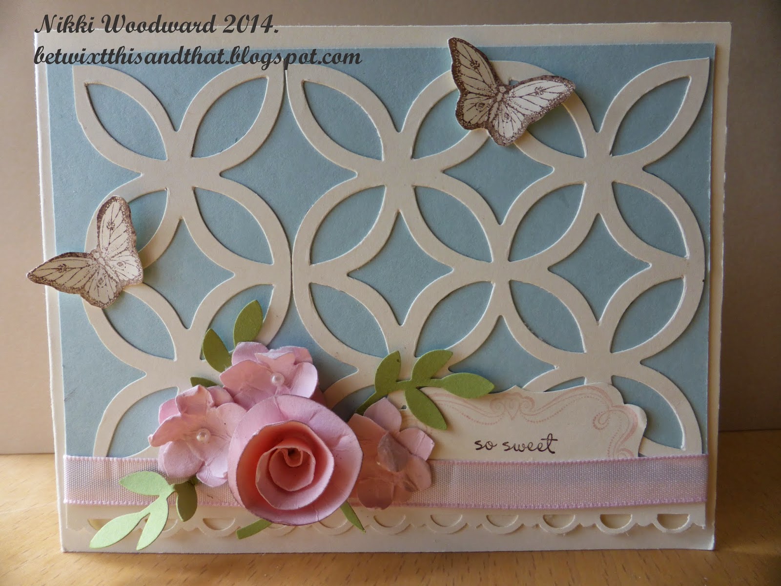
Couple of cards for March, the first being a spring themed flowery card. I used the Stampin' Up! lattice bigz die for the background, I just love that die, its 4x4" so showing here is one and a half of the die cuts, but the other half piece wasn't wasted .. see below what became of that :)

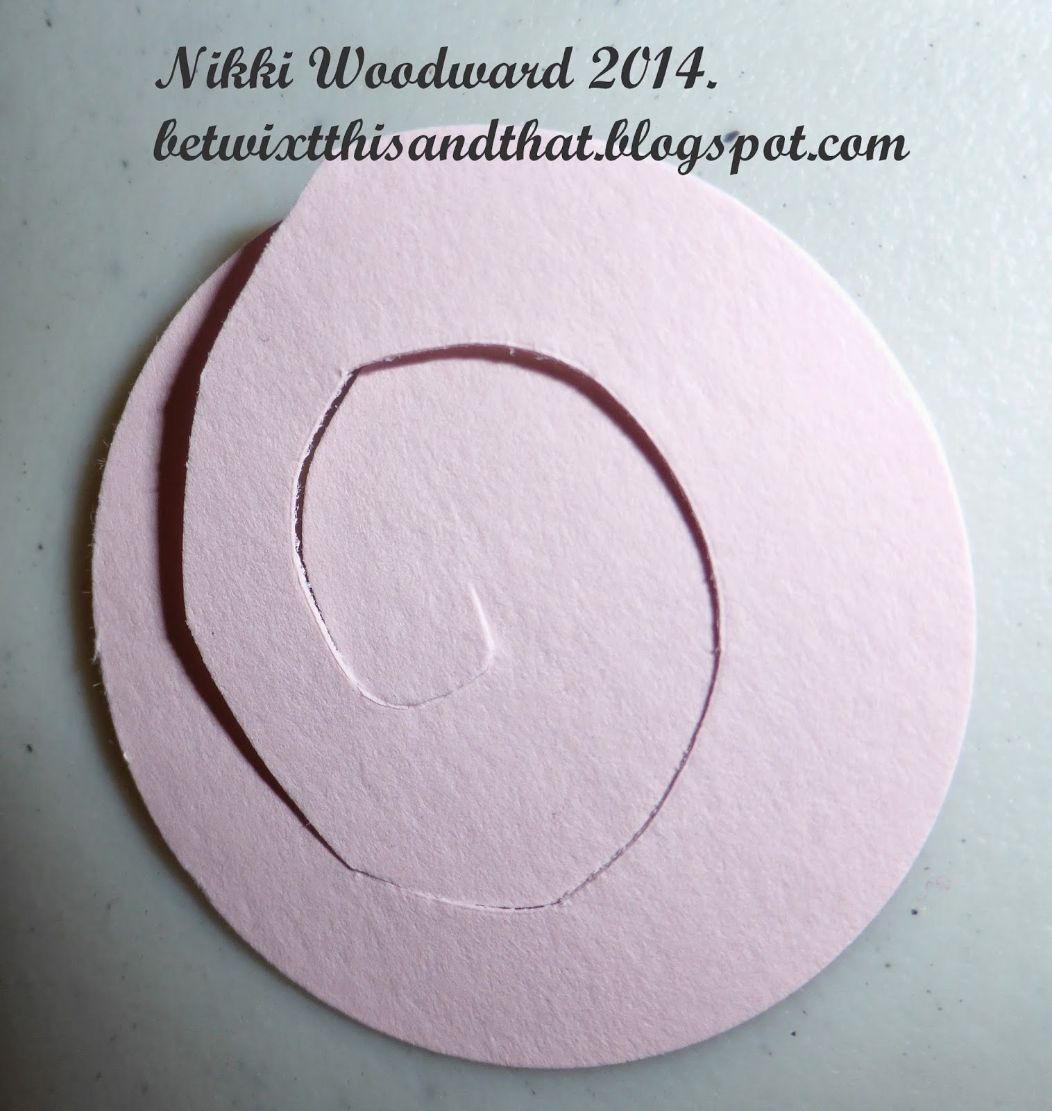
The rolled rose was made by punching a circle from pink cardstock, cutting a spiral and rolling it up. So easy, yet always an original and interesting result. Start from the outside, roll in, keeping what will become the bottom piece flat. The inside (where the spiral cut ends) will form the base of your flower. I use a hot glue gun, put a blob onto a silicon mat and scrape it up with the flower base, then seal it shut.
The little flowers were punched with a flower punched, then rolled and scrunched up to break down the fibres. The top and bottom layer start to separate, then you carefully peal them apart. They give a delicate detail to any flowery project.

The inside of the card was made to be pop up, by using that spare cut off piece from the die cut, mountain and two valley folds. Its always a nice surprise when you open a card to find something fun and interesting inside :)
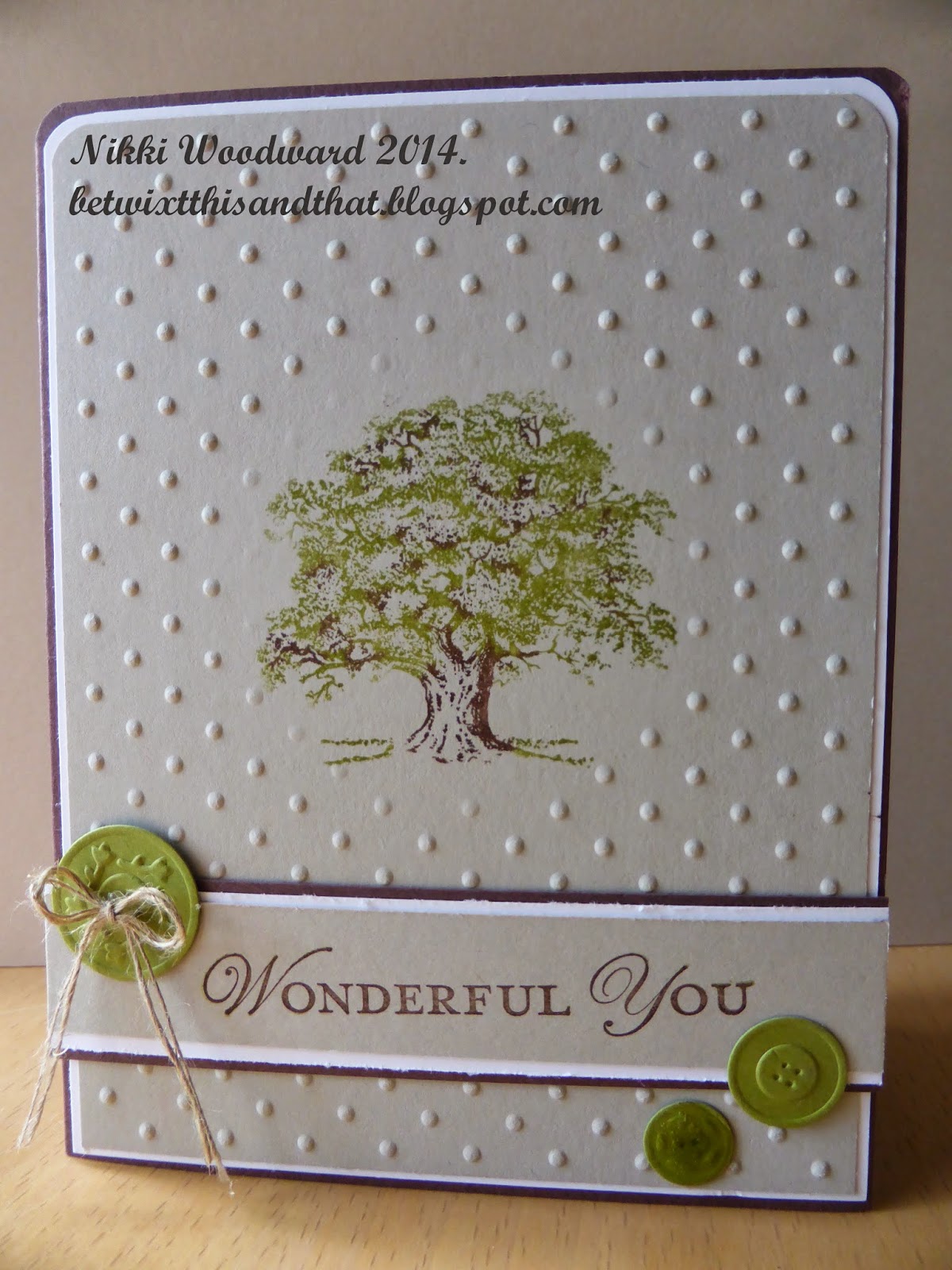
Another project had a more masculine or mature feel, the sahara sand, old olive and chocolate chip worked so well together. The oak tree was colored with markers, the green first, then the brown detail added. Do you notice that the tree is stamped on flat cardstock ? Details of that below ...
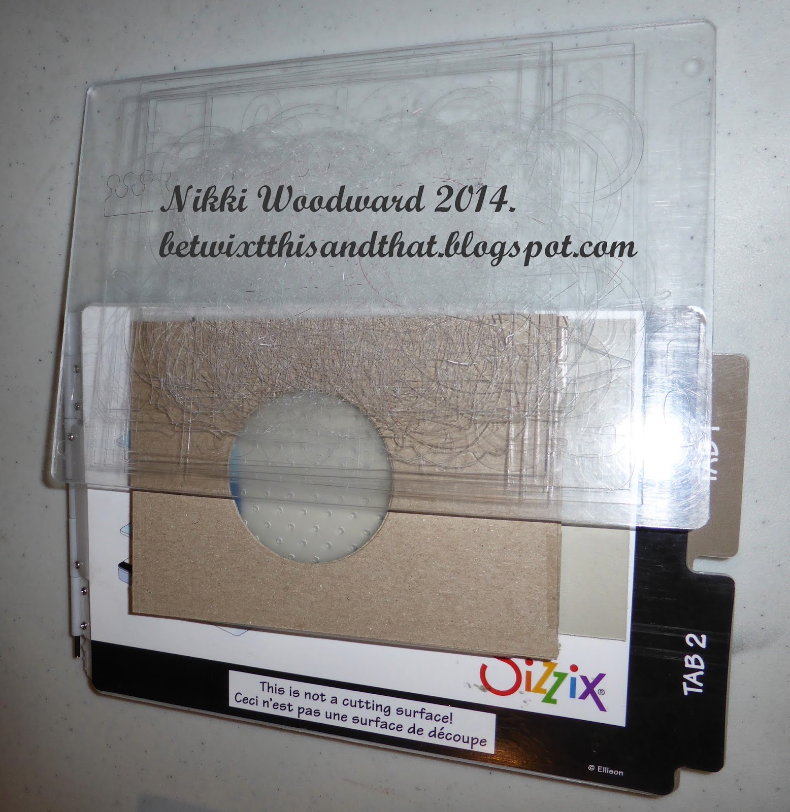
I made my own diffuser, by using two pieces of brown cardstock taped together. A diffuser basically keeps the pressure on or off certain pieces you are embossing. For this card I wanted that circle to be flat, so I made circle cuts in the card. The sandwich for this to work was : Multipurpose platform on all tabs, embossing folder with cardstock inside, diffuser placed on top, then the top acrylic plate. Run through the big shot. Note that is you are ever making your own embossing layers, you need to think about and test how you build your sandwich to get the right amount of pressure.
Hope you learned something, thanks for visiting :)

Tuesday, March 11, 2014

Alternative 70th Birthday Card - SDC 137

Making a card for a funky, bee keeping, alternative guy on his 70th Birthday, and participating in the Stampotique Designers Challenge :) Who says I cant multi task ... lol

I made the textured background flowers from tissue paper. They resemble carnations, but I am thinking lotos fruit, and my favourite lines of poetry sprung to mind .... "And, like a downward smoke, the slender stream. Along the cliff to fall and pause and fall did seem .... (Tennyson, The Lotos-Eaters). Lots of paint, stencilling (notice the honey comb), fussy cutting etc etc. This is the Birthday boy, all relaxed, dreaming in his Lotos-Eaters world .....

I wanted Baby Cthulhu to feature, so stamped him onto shrink plastic and colored with copics. He is simulating a bee ... because after all, this is an imaginary, dreamy kinda world :)
I'd quite like to visit there myself, wanna come ?


Thursday, March 6, 2014

Freedom to Sing journal page

I was fortunate enough to encounter Karen from Southern Ridge Trading Company at a craft event recently, and spent time looking through her baskets of wonderful-ness, various wooden and chipboard die cuts in all shapes and sizes, some delicate and intricate, others more sturdy - it was exciting. 

One little bird caught my eye. He was bagged up with his little friends but was desperate to feature in my next art journal page, so I enabled him ! lol


Here is a close up of the right side of the page :


The inspiration for this page came from a poem I had recently read about acceptance, and in particular accepting ourselves for who we are. Unfortunately I didn't note the authors name of this poem. I would like to think we all have the freedom to sing and simply 'be'. This bird was perfect, he looks confident and was the perfect size.

The background is made from a Donna Salazar Designs paperpack called Fun & Funky, I was loving the chicken wire. The torn pieces were glued into my Moleskin art journal with gel medium and I coated the pages so that I could go in with my Faber Castell Big Brush pen to add some depth and shading to the background. I whitened the edge of the page with white acrylic paint. The whimsical birdcage is from a Prima stamp set.  I stamped the words using an Image Tree alphabet stamp set and applied a washi tape musical road for my bird.

A close up of my bird :
He is quite thick, sturdy chipboard. I put a layer of clear gesso onto him to get a little tooth for my gelato's and so I could work with a wet medium. I colored him with chocolate, butterscotch and tangerine gelato, and used my aqua painter to blend and move the colors around. As you can see, he has red lips /beak.... yes, he is a very fortunate whimsical bird. lol. A couple of layers of clear embossing powder put the finishing touches to his appearance. Isn't he cute. 

Your instructions for today ... go forth, sing and be you - everyone else is already taken.
Nikki x

Stampotique February atc swap

The Stampotique girls were keen to go again with the atc swaps, so I organised another, entitled 'Outside the Box'. I am loving these exchanges so much, I hope it goes on forever ...

My interpretation of the title 'Outside the box' was that Mothloved is feeling left out, she is a square peg in a round hole, feeling a bit insecure. Also, the tab protruding from the side of the atc is on the left, 'left out' - get it ?

I randomly clear gesso'd my water color paper, let it dry, then colored onto my craft mat with a blue and purple gelato, spritzed with water and 'smooshed' (is that a word? LOL) my paper through the mixture. I went in afterwards and did some more specific painting and applied a little contrasting ocre. The texture of the paper turned out amazing, it was scratchy and abstract. The ungesso'd areas are darker. I stamped Mothloved and embossed her, then painted white acrylic over her body parts and spots on her dress. I painted her tshirt purple. The edge was lightly sponged with black soot distress ink.

The tab was punched with my envelope punch board and 'left out' stamped. I love the contrast between the smooth shiny embossing and the gritty background.

 I always decorate the back of my atc's. If I spend that long planning and executing the front, then I want the back to be just as great. Painting and a little second generation stamping make the perfect atc back.
The atc was sent to the UK, the recipient LOVED it :) Result ....

Designs By Ryn Celtic Bird

A new stamp to my ever growing (house groaning under the weight) stamp collection, is a beautiful set from Designs by Ryn. I loved working with it, and made a cute card for my card box. The background is sprays from Dylusions and Lindys Stamp Gang onto water color paper. I stamped the bird with black versamark and embossed with clear embossing powder. I colored the bird in with my signo white gel pen. Its subtle, but quite special. A hero art flower stamp in the background, using pale green ink to keep it subtle. I wrote the sentiment, and used clear pops to embellish.
Published on Ryn's blog :
http://www.designsbyryn.blogspot.ca/2014/03/customer-gallery-10.html

Retreat and bead making ...

I had fun at a craft retreat last weekend, its something I really really look forward to, and plan for. I never pack kits and plan pages really though, I just have general thoughts and ideas. I tell ya, I'm like a one-girl think tank ... I get an idea and then start imagining all the possible variations on that theme, a play on words etc. It can get pretty far fetched and bizarre - I love it  The hours just fly by .... but it seems like I have only been there for a few hours and its time to pack up to come home ! How can time be so deceptive like that ? Another thing about crafting events that I 'dont like' (LOL) is that it doesn't matter how big my work area is, within an hour or two I am operating in a 12" square area !!! Stopping to tidy away and discover something you lost 6 hours ago ... its like entering an alternative time dimension .... Seriously if you have never been to a crop or retreat, you should try it. You meet great people and its a great source of inspiration.

One of the projects I did this weekend was to cover a gift box for cards. Quite liked the front of the box, but LOVED the beads. So easy, so much fun and so amazing and durable. Thank you to JenniBelli for her youtube tuition. Beads are just long strips of tapered patterned paper. Start to roll the widest end first, to the smallest. I applied a bit of glue along the way to keep it from unravelling, but the whole bead is coated with a couple of coats of clear nail polish. Fab, or what ....
Thanks for stopping by

Sunday, March 2, 2014

The future looks bright

A chance encounter has lead to an exciting opportunity for me.

I met Karen, who runs an amazing company selling chipboard and wooden shapes. Her items are so beautiful and many of them so finely detailed, I have never seen anything like it. The possibilities are endless with these little beauties, and as a fellow crafter I'm sure you will understand : I just HAD to have some of them ..... lol

After working with them, a horse shoe and adorable little bird, Karen asked me if I would join her design team. I thought about it, for maybe a nano second and said yes :)

I am very excited to be part of this new business venture. Stay tuned for some yummyness and inspiration .....

Check out the store and blog. Both have a fairly new web presence and are being populated bit by bit, so maybe you'll just have to keep checking back for more :)

http://www.southernridge.net/

http://southernchipboard.blogspot.ca/

Have a great day x

Tuesday, February 25, 2014

Personalised Birthday

One of the fun things about being a crafter is being able to personalise cards and other projects for gifts. A friend asked me to make a special art card for a male relative. He is apparently a 'man about town', quite chic and arty. We discussed the card and decided on a layout scraplifted from an atc I had made.

The resulting card is :

The male image actually came out really well. I sprayed the background with Dylusions sprays on a good quality, flat water color paper. I also sprayed one of the Dylusions stencils, Bert, with similar colors. I then lifted the inked Bert stencil and laid it wet side down on top of the sprayed background. I pressed it and then lifted the stencil from right to left. Some of the ink ink lifted and pooled on the left side, giving dimension and interest to my male image. I know, wonderful eh ! lol Took ages to dry by the way and I didn't use a heat tool incase the ink ran.

The letters are die cut from a pti alphabet set, the 50 is from a Tim Holtz die. The rest is doodled, hand written words etc.

The recipient was over the moon, he loved it. R E S U L T ....... lol

Thanks for stopping by :)

Sunday, February 23, 2014

Smash booking begins .... Cultivating Optimism

I recently heard a presentation about happiness by Dr Mark Holder : the components and characteristics of what makes us happy. It was all based on psychological study, some really interesting experiments and hypothesis. Some of the elements that were discussed hit home to me, in particular that happiness is positively correlated to optimism : more self esteem, health, happiness and morale. Makes sense - right !

One of the options to boost optimism was to write about your ideal self and set obtainable goals. I think this should be extended to positive bits of our day-to-day lives and what makes us happy, what are we proud of, our thoughts, finds, meaningful quotes etc etc. I can sometimes lose sight of these in the mundane reality of day. I think I will also record some of the stuff that gets me down. In a little while I will get a clearer picture of my days and get back in touch with myself.

So here goes, my smash book .....

I bought reasonably priced Moleskine Cahiers. The paper is thin, just sketch paper, so I need to learn not to over embellish or stamp. It isn't meant to be a work of art, of wonder and ooohs and ahhhhhs. But a place for me to have fun, record some stuff and be myself.


February 2014 cards

Two lovely cards in Feb 2014, to master some crafting tools : the stamp a ma jig, which is quite the vital tool for accurate stamping; and aqua painter. Circle frames were cute with thinlit dies. Tip - DO NOT overlap dies in your big shot or other die cutting machine. You will definitely bend and possibly break the dies, but you could damage your machine too.

The first card was inspired by Chinese New Year coupled with an appropriate sounding proverb "May happiness be your destination", red and gold. I love the brushed gold washi tape and the cardstock. The popped up lanterns were stamped onto white cardstock, covered in washi tape and then punched out with a 3/4" circle punch.

The second card was a little more arty. The background was painted with an aquapainter onto water color paper with subtle colors of pigment ink. Its not a drastic coloring, but it adds ambience and depth. The dream catcher was made from a doily stamp and a frame made from circle thinlits and lightly sponged. The feathers are from the fine Feathers stamp set - I have been ogling that for ages. Finally its mine :) The feathers were lightly painted over with the aqua painter or blender pen to make them look a little more real. How cool are those candy dots for the beads. Yay. I have to thank Vicky Papaioannou for the inspiration. She did a journal page a little while ago in a similar style.


Thanks for stopping by, please leave a comment :)

Saturday, February 22, 2014

SDC135 - Acetate - Icarus grounded

Corrie's challenge this week on the Stampotique Designers Challenge blog was to use acetate.

Straight away I knew that I would stamp an image onto acetate and make a really cool background, which morphed into a spread in my art journal. You know how these things go ... lol

Everything in my art journal is deep and meaningful and often tells a story, its my form of sanity, or art therapy. I put things in my journal that mean a lot to me, memories, sayings, thoughts etc. The depictions may seem random, but they are grounded in meaning for me.

For this journal page my plan was to go back to ancient Greek mythology and for 'Angel boy' to become Icarus. If you recall Icarus had wings held together with wax. Regardless of warnings not to fly too close to the sun, he went anyway. Ultimately the wax melted and he fell into the sea and drowned. Literary interpretation of this myth have pointed to the consequences of personal over-ambition. I class myself as a realist, I am honest and true to myself, whilst I have dreams and ambitions, they do not exceed my ability - most of the time :)

This is the page in my Dylusions large journal : It makes me soooo happy.

The page was painted with various shades of orange acrylic paint. Its hard to capture the glow of the background sun behind Icarus, but I hope you can see here how it glows. The black frame I made is actually layered and raised with dimensionals. The wording is "Icarus grounded" and I hand wrote that and drew the stars. By that I mean he has his feet firmly placed in reality. He is not exceeding any limits, neither does he have any delusions of grandeur.
Below is a close up of the sun before everything was adhered together. To create the texture I used the mini tie die stencil by Crafters workshop and gesso. Lindys Stamp Gang Starburst sprays and Inca gold are responsible for this shimmer and glow - isn't it just wonderful - sigh ...... 
Once the acetate was on it became even shinier, these reflective properties make the sun appear even brighter. It is positively glowing.
Just to prove it is a transparency, I took a pic of the stazon stamped 'Angel Boy' image, then I colored the back with a black copic marker.
I just read on the Stampotique Designers Challenge blog that my creation was chosen as one of the top three for this acetate challenge. I am so happy about that, I put my heart and soul into this page, its very personal and nice to be appreciated, especially amongst so much other amazing talent. http://stampotiquedesignerschallenge.blogspot.ca/2014/02/sdc136-monochromatic.html

Thanks for stopping by, hope you like my page :)

Friday, February 7, 2014

SDC133 - Heart in your Art

Its pretty easy to include hearts in your Stampotique art, so many wonderfully stamped heart images. I love the idea of a little critter left hanging from the heart bunting :) A really good title for this would have been 'tugging the heart strings' LOL.
Thanks for stopping by ...

Saturday, February 1, 2014

SDC132 - Winged Things

I had some atc fun today with this challenge set by Arwen, entitled Winged Things.

Being a lover of fussy cutting ... (weird I know, but I can happily do it for hours), I did a little fussy cutting and surgery on a Stampotique stamped image, and I have to say I love the versatility of it. I can make those little guys do just about anything ! Tree topper is 'wing-less' and wearing Prom Queens feet ! lol

Here is my creation, a little acrylic paint, a stamp, copics, clear gelly roll pen, black soot distress ink and a fine line marker... and tadahhhhh ... my creation for this challenge :)

Thanks for stopping by :)

Sunday, January 26, 2014

SDC131 #2

A card I made for a boy, I love including pink in boys cards. With a wonderful stamp like this Smile Stampotique stamp, its already 'masculine'  ;-D I actually whitened his teeth with my signo white gel pen - I though that was kind of approriate. hahaha

The inspiration for this card came from the Tim Holtz photo strip ribbon I bought today. Thanks Tim :)

This is my second star submission to the Stampotique Designers Challenge, so thought I would do something a bit different than stars in the sky.

Thanks for stopping by :)

How exciting that the card I made was picked as one of the favourites on the Stampotique Designers Challenge blog http://stampotiquedesignerschallenge.blogspot.ca/2014/01/sdc132-winged-things.html — feeling awesome.

Tuesday, January 21, 2014

January 2014 cards

Can you believe is already 2014 - wow, time sure flies .....

With the New Year, comes the new spring Stampin' Up! catalogue, and Sale a bration starts soon....

In January, these are the cards we did at class :

The first was a bargello Valentines. I have to say that this very well maybe the brightest card I have ever made ! lol This small paper pack from SU was a surprise, the colors are so vivid, there is such a massive range of patterns, and they all work so well together.

Bargello is a quilting technique, that works beautifully with paper. The technique will be explained below. The heart shape was cut on my big shot using a thinlit die, and the 'love' was die cut in the crumb cake to show the negative image through to the real red cardstock. A little white bow to finish off and a little white doodling with a signo gel pen :) Cute eh !

 I cut thin strips of cardstock (.5 and/or .75" width) and adhered them to a 6x5.25" piece of cheap copy paper, as seen in the pic below. It is important to totally cover the copy paper with adhesive, so that every single edge of the patterned paper is securely stuck down.  Then you trim the piece so its all straight edges, turn the paper so the strips run horizontally and cut them in your paper cutter (.5 and/or .75" strips). I then had a piece of whisper white cardstock (4x5.25"), where I layed down the thin strips, staggering them to get the bargello effect, and trimmed the excess.

The second card is a punch art, shaped card. I have seen this card online so many times online, but had never made it... until now. Often this card is yellow, as in beer which is a great mans card, but this is a root beer float - I think.

The actual card base is naturals white card stock, that I cut down to make the card 5.25" x 3.75", this is so that with the bubbles and handle added, the card will still fit into a standard envelope. I used early espresso card stock and ink, sponging the bubbles lightly. They are made from the circle punches 1", .75", .5 inch and .75 scallop circle punches. The handle is cut with the large and medium oval punches. Tip :  cut your smallest oval first, then you can more easily align the larger oval over the top of the shape to make your handle. The sentiment was stamped in versamark and embossed in white embossing powder. Tip : Use the dust buddy on the area you want to emboss, so that the embossing powder doesn't stick where your fingers have touched. The three brown strips are 1" in diameter and the bottom edges are rounded with a corner rounder. I hand cut the bottom of the glass for a slightly more realistic effect. The straw is a striped paper from Christmas paper, but you can easily make it with a marker and .5" strip of card stock.


Sunday, January 19, 2014

'Beloved' Stampotique ATC exchange

I facilitated an international ATC exchange in the Stampotique facebook group, it was so much fun. The anticipation of waiting for the atc I made to arrive in the UK, and waiting for the one mailed to me from Germany was by far the most exciting bit. Its so rare to get fun mail these days, just bills ...  

A big thank you to 'Dweeze' for being the centre piece of my ATC.
I used glossy card stock and did the wax paper resist technique with a Spellbinders Impressabilities - Fleur de lis stripe. I sponged the cardstock with wild honey and salty ocean distress inks.

I used Stampin' Up! card stock, cherry cobbler for the heart and it was die cut with the Sizzix heart - double small die, and embossed with a baroque embossing folder and I did some sponging in cherry cobbler, doodling in white sygno gel pen.
I printed the sentiments from my computer and embossed the random red detailing on the left of the atc.

Dweeze (such a cute little guy x) was stamped onto acetate with black Stazon, then also stamped in memento tuxedo black onto white copics paper and colored with copics (E02, E01, E000, B05, B02, 100). He was paper pieced over the stamped image. Then everything was adhered together, with the clear card stock inside the outer layers of the atc. I just LOVE how you can see through the card stock.
I have to say though, the back is my favourite. With a black sharpie marker I colored the silhouette of 'Dweeze' on the clear card stock, and wrote the atc title.
So many layers and such an adorable atc. It was great to participate in this exchange, so many wonderfully creative people in the  Stampotique facebook group - so happy I found it, its just my style. I was wandering around in cyber space looking for a home, think I found one :)

Friday, January 17, 2014

SDC131 - Shoot for the Stars

How exciting that a Stampotique order arrived at my door today .... I did the happy dance to my craft room, sat down and began to create. Have you seen all those cartoon comedic posts about doing something because someone said it will be fun, and it really isn't ? lol A lot of them are so random and really amuse me. I had this idea for Shoot for the Stars as soon as I saw this weeks star challenge, poor Dweeze, suspended there in outer space. I was really happy with how this page turned out, especially how using Stampendous embossing powders made the stars shine - I used aged copper, aged silver and shabby pink.

Thanks for visiting, hope you like it :)

There is so much detail and texture in the stars, I thought I would take a few close up pics of them in a duller light to avoid the shine and sparkle. I LOVED how this embossing powder melted, becomes fluid and moves around. I wanted to add some pink, because Dweeze is in touch with his feminine side wearing his pink coat :)


Thursday, January 2, 2014

SDC129 - Happy 2014 Stampotique style

Stampotique !!!! Wowzers .... love love love

Happy 2014 everyone :)


Paper pieced Prom Queen on this Dylusions sprayed tag with stencil by crafters workshop. I made the background paper with a rubber necker stamp and distress inks. Letters die cut using pti numbers with the same home made stamped paper.

Everything outlined with white prisma pencil to make all the relevant aspects 'pop'.

Happy New Year :) Hope 2014 is a good one for you x

Designs by Ryn Artist Trading Card (ATC)

My groups latest ATC title was 'Pig Out'.  So my gorgeous origami pig stamp, from Designs by Ryn, made its debut :)

I paper pieced the pig with b&w origami paper, adding a few red dots with liquid pearls to mimic the Japanese cherry blossom and tie into the red background. I cut around the paper pieced pig leaving a thin border of card stock, which helps to distinguish the pig from the busy background.

On a foam pad I used my 8m McGill stylus, rubbing his belly in a circular motion on the back of the pig to give him some dimension, make his belly pop out a bit. I don't know if you can really see the effect in the pic below, but it is there and enhanced by using thicker pop dots in the centre of the pig to adhere him to the ATC.

I coated the pig in a thick layer of diamond glaze/ crystal effects to give him the glossy look, that turns him into a thick and sturdy embellishment. Adding something shiny/glossy to the ATC draws the eye directly to the object, in this case the pig, and makes the colours appear more vivid.

The background card stock was cut to 3.5 x 2.25" and covered in strips of various origami papers. The outside was sponged with black soot distress ink. The red strips and 'PIG OUT' title added. I made the little red tassel using red embroidery thread, my TH tiny attacher and a silver brad.

The pig out spin on this ATC is that the pig is outside of the ATC - see his head sticking over the edge, and also that he 'pigged out' and has a rounded body shape - don't we all post Christmas ? LOL


Hope you liked my ATC, thanks for visiting.

Published on Ryns blog :
http://www.designsbyryn.blogspot.ca/2014/01/customer-creation-gallery-8.html

Friday, December 27, 2013

Decembers mixed media project

We did something slightly different this month, a mixed media 5x7 canvas. The canvas came pre gessoed, so we could get straight on with stamping and spraying. 

The snowflakes and Christmas sentiment were stamped in stazon, a permanent ink since we would be spraying next. 

I made sprays using SU spray bottles, rubbing alcohol and a few drops of SU reinker, marina mist. 

Then I began to build the tree, with a variety of designer series paper and cardstock. I loved the higgeldy piggeldy look of the tree. 

For the the tree trunk, I embossed chocolate chip core dinations cardstock with the woodgrain embossing folder, cut the trunk freehand and then sanded the top layer of brown off to reveal the lighter inside of the cardstock.

The layers of paper were glued down, then white acrylic paint highlighted the tree and the outside borders of the canvas. 

Finally doodling, adding washi tape and rhinestones and an embellishment on top of the tree.

The Merry was cut from silver foil paper using the dies in the winter mini catalogue and adhered. The glue of choice was matt mod podge, as it dries practically clear and can be liberally applied with a paint brush.

Few things to remember : 
Do not use a sharpie marker on anything unless its totally dry - unless the sharpie wont work again !
The blue spray, using reinker is water soluble, so if you wet it it will run.
I use alcohol rather than water in my sprays, so they dry quicker. It is definitely smelly though.
To cut the Merry, use a piece of wax paper to get a better cut, and more easily removable from the die.


I loved doing this project with my stampers groups, I especially loved how much they enjoyed it too. Everyone was very proud of their creation and I'm sure it took pride of place amongst their Christmas decorations, as did mine :)

Thanks for stopping by x

Thursday, November 28, 2013

November cards

A couple more Christmas cards for the collection .... lol

Two Christmas cards were completed at the Novembers stampers groups.

The first is using the new labels flip card die. Such an ingenious creation, I love the way the card flips from the front penguin image to the Merry sentiment. I have to say though, its very hard to capture the flip in a photograph, so I have included a few pics.


The cute little penguin is made with the owl punch.

Ingredients :
Stamp set : Snowflake Soiree
Papers : Smoky slate, whisper white, basic black, pumpkin pie, silver
glimmer paper and winter frost dsp
Ink: Pool party and black
Accessories : Owl punch, Stampin' Up! flip card die

The second card is using the beautiful pointsettia stamp in Joyful Christmas stamp set. It was stamped and embossed in white on velum, then fussy cut.

The background is using the watermark technique on crumb cake cardstock (stamping with versamark and letting it dry). The faux stitching is done with a piercing tool and essentials paper piecing pack, the 'sewing' drawn in by hand with white gel pen. What I like about using the paper piercing pack is that the lines will always be straight and the the holes the same size. When you draw them in it looks a bit wonky - suitable to my sewing style and ability ! lol


Ingredients :
Stamp set : Joyful Christmas
Papers : Whisper white, crumb cake and cherry cobbler
Ink : Versamark, cherry cobbler
Accessories : Velum, white signo gel pen, black sharpie to color centre of flower and basic rhinestones, dimensionals to pop up centre of flower.

Sunday, November 17, 2013

How to get stubborn Stampin' Up! stamps to stick

I have heard various recommendations for ensuring SU stamps stick to the block. To be honest, none of them do it for me and are problematic. Anyone who has had their inked stamp fall off the block and onto their beautiful stamped image will agree I'm sure.

Other companies who make thing cling type of rubber stamps mostly do not put the image onto the back of the stamp, so avoiding this non sticking problem. But I like the sticker, it helps guide my stamping so I always mount the stamps with the sticker, and then I perform a little magic ....

The 2-way glue pen is a permanent and temporary glue. If I apply glue to a piece of paper and stick it to another, it dries and is stuck very well ... sometimes too well ! lol But, if I apply dots of the glue to a surface and allow it to air dry (for about 6-12 hours), then I get tacky glue that will stick to my block temporarily. Taaa Daaaah magic eh ! The glue stays tacky for a long time, after a year of two of use I may reapply a few dots. 

Also, do you notice that the glue is blue in the pic below ? It dries clear ... how cool is that. So, you can see where you put it. I really like this glue, I use it a lot. I have even been know to make my own glue dots ..... now theres an idea ....


Thanks for stopping by, have a great day.

Monday, November 4, 2013

Totally groovy pen holder - I made that !!!

Fed up with pens all over the place, so I spotted a similar idea to this on Pinterest. If you haven't been to pinterest, my advice don't - its totally addictive ! lol Joking - its amazing ....


I had some old plumbing pipe in the garage, cut it into 4" and 5" sections and then used duck tape to hold it all together. I have to say yay to moustache duck tape


Fun tag

Have I told anyone recently how much I love Dyan Reveley stamps ? No.... well, I do ! I loved how this tag turned out, and the sentiment is just perfect :


Worry Less canvas

I heard someone say this a while ago, "Worry less, giggle more". It has now become my new motto !

Having recently recreated my craft room, I thought I would make myself a canvas. It is actually one of the wooden box canvases. I adhered an 8x8 piece of water color paper to the front and used that for sponging, stamping, gel medium, stencilling, molding paste etc, etc. I actually prefered it to working on a canvas as it is a hard background, much easier to stamp and apply pressure to. The blanket stitch edges were done with a We are Memory Keepers sew it (I think its called, but its ink not a hole maker).

The letters are die cut from a news print paper, using a Papertrey Ink alphabet die set.

This wooden canvas now has pride of place in my craft room :)

Favourite book quote - Cloud Atlas

I read Cloud Atlas a while ago and am totally in love with the ending of that book, it is such a profound statement : we are many, but each one of us is important.

"Only as you gasp your dying breath shall you understand
Your life amounted to no more than one drop in a limitless ocean
Yet what is any ocean but a multitude of drops"

If you ever feel low or disillusioned, its good to remember that we, each of us, matter. For me, I took this quote to heart. After years of child rearing where I put everyone else first, and neglected myself resulted in negative consequences for me. I am now beginning to see the light .....

I wanted to do a page in my art journal to acknowledge this. It had to be just right .... You can relate to that type of pressure, right ? lol Then I came across the amazing water stamps from Designs by Ryn. How absolutely wonderful to use them for this page, the realism and attention to detail in these rubber stamps is just amazing. And I think the stamps did justice to the book quote and my feeling about it.

I gesso'd my pages and used Lindy's Stamp Gang starburst sprays for the background in my art journal. I don't know if the pic truly captures the gleam and beautiful colors of these sprays. When I stamped the raindrops in black memento ink, the ink stayed wet enough on the sprayed background that I was able to emboss it with clear powder. The result is a wet looking water drop - perfect - yeah !

I printed the quote from my computer, sponged and adhered it.

There is actually a slit cut above one of the lines of text on the right hand page, there is pocket where I have journalled why this quote is so important to me. It is private and I didn't want it to be written on the page, not everything is for sharing :)

I hope you like it :