.JPG)
Monday, June 16, 2014
Punch template
A friend showed me this idea recently, thanks Sue Revill .... and I thought I would post it on here as its such a great idea, both to check which is the best punch for your sentiment to fit on, but also some stamps seen through a punched shape take on a whole different look. Give it a try, its really useful.

Sunday, June 15, 2014
Art journalling .... Hope you like it .... duh !
A few times recently I have added at the end of my art journal/mixed media blog posts, "I hope you like it". Also, when at events people come around perusing others work etc, and we feel the need to explain and secretly hope they'll like what we are pouring our time and emotions into. But you know, really it doesn't matter. Mixed media and art journalling is such a personal journey. For me it is akin to therapy, a place I can safely process and depict my thoughts. So I may change my 'hope you like it', to 'hope you find some inspiration' - meaning both artistically and also emotionally. Thanks for listening ... here ends the sermon x
Age journal page
Purple overload ..... lol, but I was in the mood and besides purple symbolizes magic, mystery, spirituality, the sub-conscious, creativity, dignity, royalty – and it evokes all of these meanings more so than any other color.(www.colormatters.com) - so how could I resist
I did a background for a page ages ago, it's textured with gesso, numbers die cut and glued down, then I painted with acrylic and stamped some circles and sponged with brown stazon. The page is so lovely, soft and shiny. I wanted this page to be about age and how the number just keeps ticking on .... tick tock ...
 I journalled with a white fine line writer which took a little getting used to but was awesome, you can see how clear and fine the white acrylic paint is.
 Thanks for visiting.
I did a background for a page ages ago, it's textured with gesso, numbers die cut and glued down, then I painted with acrylic and stamped some circles and sponged with brown stazon. The page is so lovely, soft and shiny. I wanted this page to be about age and how the number just keeps ticking on .... tick tock ...
Thursday, June 12, 2014
Some exciting Sailing Pineapple news
I was very happy to be selected on the design team for The Sailing Pineapple. They sell digital stamps that are very cool and whimsical, something a bit different. I like digital stamps, in many ways they are much more versatile than rubber or photopolymer etc. as you can change the size and dimensions before you print them. You can even edit them online once you download your images... the possibilities are endless.
Check out the store :
https://www.etsy.com/shop/TheSailingPineapple
And please join us for weekly challenges on the blog :
http://sailingpineapple.blogspot.ca/
Check out the store :
https://www.etsy.com/shop/TheSailingPineapple
And please join us for weekly challenges on the blog :
http://sailingpineapple.blogspot.ca/
An eclectic collection ...
Just a few cards I have made recently ..... for various occasions :) Hope you like them x


Animals atc
I know, I know ... I'm going a bit overboard with the dancing lights ... this is the last, I promise. LOL. This atc was made for an atc trade with some talented girls in the UK, the title being simply 'animals'. Well, that was the complicated part because I have a whole big box of animal stamps - what to choose ??? I liked the idea of a native animal, a silhouette, coupled with an interesting sky. So tadaar, here is the finished atc :
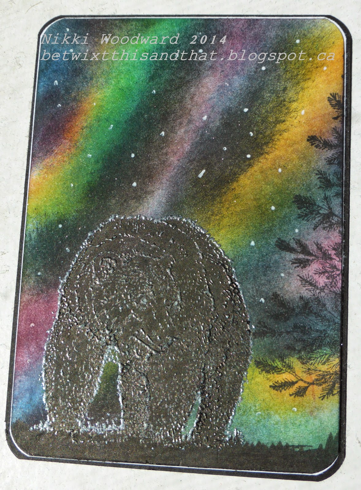
The bear was stamped in black versamark and embossed with Wow super fine pearl white embossing powder. What that did was left a white/metallic looking sheen on the bears coat - exactly what would be seen in real life as the light reflected from his coat. I colored him with Faber Castell artist pit pens in black.
Thanks for stopping by, please leave a comment.
His and hers outhouses ...
Not quite the traditional wedding card I know .... but I have to say this was much more fun to make, and was greatly appreciated by the bride and groom - or at least that's what they told me ! lol
This aurora borealis background was similar to the cistyscape atc I made a few weeks ago, but with this card I used an Impression Obsession stamp. Lots of coloring with pencils and fussy cutting followed.

Of course you want to see whats inside those doors ... drum roll ....

Yes, two sets of eyes. I made him a bit higher than her - its imperative to be anatomically correct ;-)
Hope you like it, please leave me a comment - thanks.
Soaring High
It's graduation time for many fortunate students, so a 'Soar' card seemed fitting. I really enjoyed working with the delicate but sturdy bird pieces (NAT-295) from Southern Ridge Trading Co. I used them to dry emboss pink core'dinations card stock, then lightly sanded the card stock to get this very textured and distressed look. I lightly sponged the birds to add to the dimensional and distressed look, and to tie in with the sentiment 'Soar' (WEL-039).
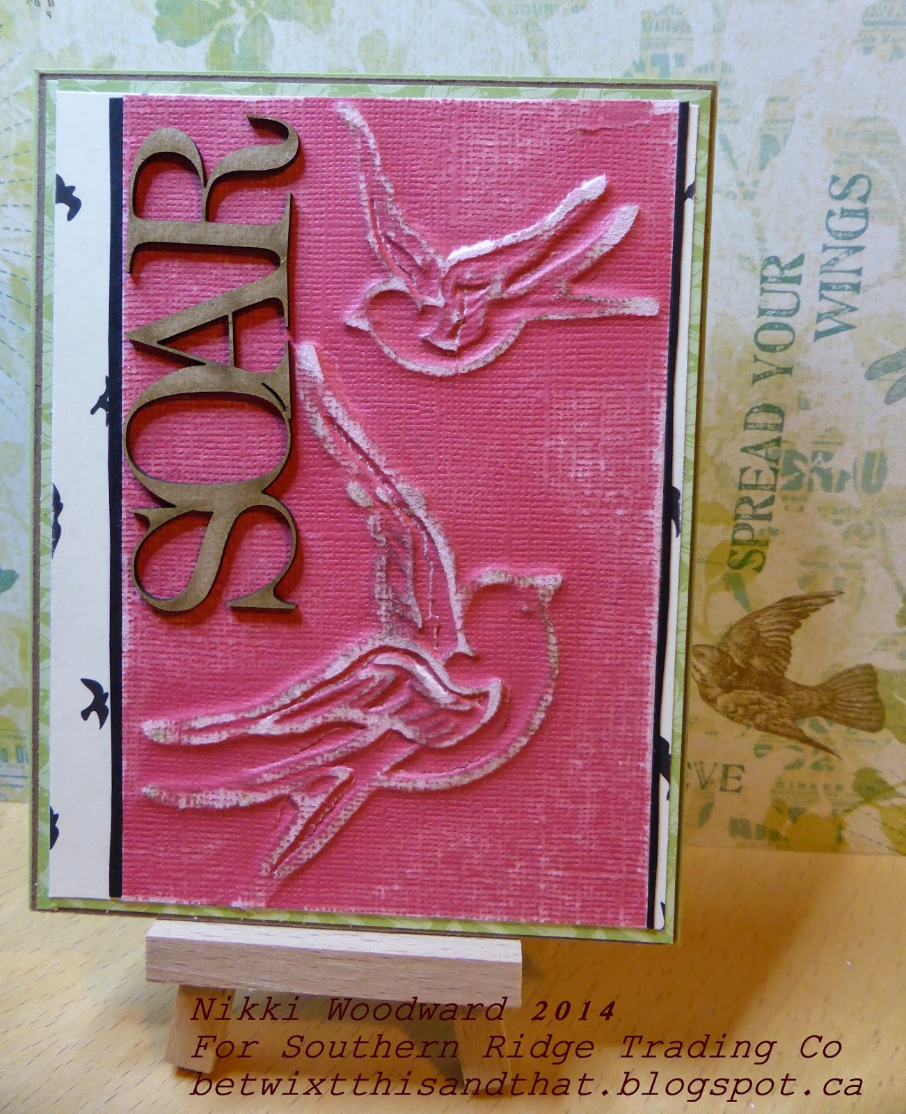
For the sandwich on my big shot, you will notice below that I used my tan embossing mat. I also wanted to show this pic of the birds so you can see how the embossing picked up all the details. The core'dinations paper does rip and bend - it all adds to the overall distressed and shabby feel.

That card was so much fun to make, I hope you got inspired and will try out this technique :)
Thanks for visiting :)
Monday, May 12, 2014
Northern Dance
The Northern lights, or Aurora Borealis is a breathtaking sight. To see the different colored lights dancing in the Northern skies is wondrous. I feel very fortunate to have seen it in all its glory a number of times, but it is so enchanting and different every time, you could never tire of it. I hope I captured the essence of it in my dt project today for Southern Ridge Trading Company. Look, I even incorporated some shadow into my pic ...

I have seen this sponging technique a few times and really wanted to try it with something other than trees and the wilderness. So decided to use this city cape chipboard piece, Misc-305 on this artist trading card. I used the middle sized piece, there is three in the pack.
The order of colors for sponging the northern lights sky is yellow, green, turquoise, purple, dark blue and black. Thank you to Melissa Banbury for demoing this technique, I really enjoyed doing it. The chipboard is painted with black gesso. The stars are done with my white gel pen.
Hope you like it, thanks for visiting :) and feel free to leave a comment.
I hope you see / experience something wondrous today.
Nikki x
Monday, May 5, 2014
SDC145 Flowers Challenge
Valerie set a flower challenge over on the Stampotique Designers Blog .... What fun, thought I'd play :)


Rather than a bouquet of flowers, in a suitable size, Twinkie has an over sized plant pot filled with blooms and insects ..... I just loved the crazy paving ... isn't it great :) The 'for you' sentiment means I can use this card for just about any occasion ... when an over sized fun flower pot is required. hahaha
Here is a close up of Twinkie and the pot. You will see he required a little arm surgery to help him carry his large load. Anyone remember the cartoon Inspector Gadget ? Twinkie has Go-Go gadget arms .... lol
This pot actually has a surprise in store though, its interactive :
You can pull up the flowers to reveal a nice stamped image "Butterflies are self propelled flowers".
I made this card by first using a stencil and distress stain for the crazy paving. Used various patterned papers for the background with a thin layer of gesso over top to meld the colors together. Twinkie is stamped in Momento ink, colored with copics and fussy cut. The flower pot is hand cut with coredinations cardstock and sanded. All of the flowers were cut from my stash of flower punches - some of them havent been out of their box for years ... they were excited to be called upon. The background is more mellow, I wanted the flowers to be the first thing you see. In real life they are all shiny, my wink of stellar pen is wonderful.
Hope you like it ....
Thanks for the visit and please leave a comment :)
Wednesday, April 30, 2014
Don't Make Mud
'Color Saturation' was the title for the April Stampotique facebook group trade.
What sprung to mind was how we all ... you, probably you too ... have made mud on your projects. All colors that mix together turn brown ... Its a lesson/learning curve we all travel on.

To make the background I used glossy cardstock, dropped a few drops of alcohol ink onto the card and blew it with a straw. If felt so childishly wonderful to do. lol. I made the mud with molding paste and acrylic paint, and when I applied it to the atc I added the texture to make it look mud-like.
Twinkie had a little arm surgery to make him fit onto the atc ... He was stamped, colors with copics, embossed, fussy cut and then dove straight into that mud.
Hope you like it xxx Please leave a comment so I know you visited xxx
What sprung to mind was how we all ... you, probably you too ... have made mud on your projects. All colors that mix together turn brown ... Its a lesson/learning curve we all travel on.
To make the background I used glossy cardstock, dropped a few drops of alcohol ink onto the card and blew it with a straw. If felt so childishly wonderful to do. lol. I made the mud with molding paste and acrylic paint, and when I applied it to the atc I added the texture to make it look mud-like.
Twinkie had a little arm surgery to make him fit onto the atc ... He was stamped, colors with copics, embossed, fussy cut and then dove straight into that mud.
Hope you like it xxx Please leave a comment so I know you visited xxx
Sunday, April 27, 2014
Making honey ...
I was so inspired by this wonderful chipboard piece from Southern Ridge Trading Company, its a hexagonal 5.5" x 5.5" pattern (PAT-274), my first thought was .... honeycomb. The thickness of the chipboard really gave the dimensional look I was hoping for, especially when you hear what I did with the hexagons .... Here is a pic of my finished project :

My bee loving friend is having a birthday and I have this really great itty bitty stamp by Unity called 'All Hail the QUEEN Bee', so it made its debut ....
The chipboard was so easy to cut into a shape more fitting to the 5x7 card I was making. I painted it in acrylic paints, a home made pale orange/gold.

While that was drying I covered the mixed media paper in black and white origami paper - my current squeeze, and a light coat of gesso. I used my gelatos to add just a hint of color, blue and orange. I sprayed the color to get a pale drip effect.
I securely adhered the honeycomb and painted the inside of each hexagon with gold Adirondack acrylic paint.I then put a large dollop of crystal effects / diamond glaze into each hexagon and spread it around. I LOVE how it looks wet, and golden just like honey.

The bees were stamped in black, embossed and cut out. I stamped the whole image in versamark and embossed in Tim Holtz spiced marmalade distress embossing powder. I paper pieced the black bees on, made their wings from velum. This was layered onto a torn background piece in co-orinating gelato colors. The crown is also in the stamp set, I stamped this and embossed in gold. That strip is raised to give some dimension.
This is how the honey shines :

This project worked out wonderfully. I hope you found some inspiration here and that my friend LOVES this card :)
My bee loving friend is having a birthday and I have this really great itty bitty stamp by Unity called 'All Hail the QUEEN Bee', so it made its debut ....
The chipboard was so easy to cut into a shape more fitting to the 5x7 card I was making. I painted it in acrylic paints, a home made pale orange/gold.
While that was drying I covered the mixed media paper in black and white origami paper - my current squeeze, and a light coat of gesso. I used my gelatos to add just a hint of color, blue and orange. I sprayed the color to get a pale drip effect.
I securely adhered the honeycomb and painted the inside of each hexagon with gold Adirondack acrylic paint.I then put a large dollop of crystal effects / diamond glaze into each hexagon and spread it around. I LOVE how it looks wet, and golden just like honey.
The bees were stamped in black, embossed and cut out. I stamped the whole image in versamark and embossed in Tim Holtz spiced marmalade distress embossing powder. I paper pieced the black bees on, made their wings from velum. This was layered onto a torn background piece in co-orinating gelato colors. The crown is also in the stamp set, I stamped this and embossed in gold. That strip is raised to give some dimension.
This is how the honey shines :
This project worked out wonderfully. I hope you found some inspiration here and that my friend LOVES this card :)
Colloquial Sayings atc
For my local group of atc traders the title for April was colloquial sayings. I googled it ... OMG so many, some weird but lots of them that I use regularly. But then had to think how I was going to suitably decorate my atc. After much ado I settled on the famous closing line from Gone with the Wind, 'Tomorrow is another day' - thanks for those little pearls of wisdom Scarlett O'Hara, yes, even if today was cr**, you can start again tomorrow ....
This stamp is from Rubber Necker Stamps, its so serene and peaceful. Her swim suit is paper pieced, the rest of her and her hat colored with copics. The sunset sky is sprayed with Lindys Stamp Gang starburst sprays, the sun is actually clear embossed on gold cardstock, its a Stampscapes symmetry sheet #1 'Suns & Moons'. My sunset gazer is sitting on cork sand ...

 Thanks for visiting, please feel free to leave a comment ...
Close up of the setting sun :)
Saturday, April 26, 2014
Monster Birthday
I felt inspired to spend a few hours on a Birthday card. I actually got started, got really quite absorbed and having fun, next thing I know it was bed time and no-one had done the dishes etc. LOL. Oh well, thats life ...
This card turned out so cute, I am really happy with it.
The monsters are from a retired Close to My Heart Stamp set (B1333 Merry Monsters), black and white origami paper and the balloon is from a retired Stampin' Up! set called Party this way. Coloring in was fun .... I used my Faber Castell artist pit pens for the two outside monsters, copics for the middle one. Just trying things out, comparing the finished look etc :) The balloon was stamped in island indigo, then white gel pen to highlight the numbers and diamond glaze/crystal effect over the top. The shaped base is cut with a My Favourite Things die, monarch border.
Hope you like it and get some inspiration here ... please leave a comment, feedback is so great. Makes us bloggers feel like we're not alone in cyber space .... hello .... is there anybody there ..... hahahaha

Had to do a close up of the balloon, look how the white signo gel pen blended with the diamond glaze, and you can just vaguely see the patterned paper through it ....wonderfulness, sheer wonderfulness ....

This card turned out so cute, I am really happy with it.
The monsters are from a retired Close to My Heart Stamp set (B1333 Merry Monsters), black and white origami paper and the balloon is from a retired Stampin' Up! set called Party this way. Coloring in was fun .... I used my Faber Castell artist pit pens for the two outside monsters, copics for the middle one. Just trying things out, comparing the finished look etc :) The balloon was stamped in island indigo, then white gel pen to highlight the numbers and diamond glaze/crystal effect over the top. The shaped base is cut with a My Favourite Things die, monarch border.
Hope you like it and get some inspiration here ... please leave a comment, feedback is so great. Makes us bloggers feel like we're not alone in cyber space .... hello .... is there anybody there ..... hahahaha
Had to do a close up of the balloon, look how the white signo gel pen blended with the diamond glaze, and you can just vaguely see the patterned paper through it ....wonderfulness, sheer wonderfulness ....
Rocky Horror Picture Show atc trade
I have seen The Rocky Horror Picture Show so many times over the years, and I even remember one day watching this movie back to back about five times. I know every line, every word to every song .... So you could say I am a bit of a fan .....

Here is a close up of the background ... very interesting layers .....

Thanks for visiting, please leave me a comment :)
In a facebook group I encountered Serena Bee (check out her Youtube channel) and we have a shared love of the movie so organised an atc trade using Octopode Factory digital images. I made her an atc featuring her favorite character - Magenta, and she made one using mine - Frank-N-Furter.
Here is the atc I made for Serena :
Here is a close up of the background ... very interesting layers .....
To make this atc I first used the Tim Holtz burlap stencil with some modeling paste. When it was dry I sprayed the background with red and orange Dylusions. When it was dry I did a little light spraying with white dylusions. See how the white sits on top of the color, but absorbs it a little - how cool is that ! When everything was dry (isn't that just the bore of mixed media art! lol), I used a retired Stampin' Up! background stamp called Canvas, inked it with black versamark and lightly touched the atc and inked stamp pad together, so that the ink only went onto the raised parts. I then embossed with clear embossing powder.
Magenta was colored with copics. Her hair was certainly a challenge as I dont have many reds. I studied her hair in google images ..... discovered it was magenta and brown so I went for a combination of R29, E55, E57 and a hint of RV69 around her face. I colored her face with E53 and then went over it with a white prisma pencil - if you've seen the movie you 'll know she wears lots of white make up.
I printed the words from my computer, mounted them on film strip washi - it is a movie inspired atc after all ! Put a little orange Dylusions over the text and outlined Magenta in white gel pen to make her pop off the background. Finishing touch was my Wink of Stellar pen - love that thing - put it over the words and her red lips .....
Here is a pic of both mine and Serena's atc's together - How wonderful are they.

Monday, April 21, 2014
April crafting ...
April crafting ...
Made a really cute 3x3 mini book from one sheet of paper, as per Tim Holtz and many other videos on YouTube. These were my favourite videos', she makes them step by step :
The first video is the scoring and cutting, the second concerns the assembly and cover :
https://www.youtube.com/watch?
Made a really cute 3x3 mini book from one sheet of paper, as per Tim Holtz and many other videos on YouTube. These were my favourite videos', she makes them step by step :
The first video is the scoring and cutting, the second concerns the assembly and cover :
Monday, April 14, 2014
Grrreat Birthday
Loved this card I whipped up with a little assistance from the retired SU stamp set 'Under the Stars', washi and copics. It is a simple one layer card, but there's just something I really liked about it. Hope you do too :)

Let it go ....
Its quite a topical expression at the moment, with the famous song from the movie 'Frozen', but this expression has a deeper significance. To let go of whatever is holding you back and bogging you down. I wanted to make a canvas that I can look at and be reminded to do just that. The canvas is a 5x7".

For the art, I wanted to make a stark comparison between the background and the gold embossed leaves (NAT-306) and flower (FLW-001), new in the store at Southern Ridge Trading Company. The background is made with acrylic paint and thick gloss gel. I wanted it to shine and hold the texture I put into it.

The leaves, flower and lettering are embossed with a number of embossing powders in layers. Gold, antique copper and aged ivory from Stampendous. The flower centre is an embossed silver metal button, with embossed gold brad centres. Isn't gold 'in' right now ... I love it. You can see the detail and colors here :
Hope you like my canvas, appreciate the sentiment and are encouraged to, if you can, to let it go.
Hugs, Nikki x
Thursday, April 3, 2014
Time Warp atc
An interesting title for this months Stampotique atc trade over on the Stampotique facebook group - 'Time Warp'. As much as I LOVE the Rocky Horror Picture Show, I decided on a Dr Who themed atc and dressed up 'Heart boy' in Tom Baker-esque scalf. Yes, I admit it, a long term Dr Who and Stampotique fan here ! So great to combine them in art.
 I had so much fun with this background and love the effect. It is meant to mimic the darkness and bleakness of space, black holes, moons, planets and never ending darkness. I heavily sponged the mixed media card stock with barn door distress ink, then went over it with black soot distress ink. Then in a bowl I whisked until really frothy water and dish soap. Holding the atc carefully I pushed the inked side into the bubbles, removed it and dried with my heat gun. I love the effect, especially the white residue the bubbles leave and how some of the red showed through. It really gives the feeling of depth and infinity ....
 'Heart Boy' is colored with Copics. I made the scalf with white sweater trim and lumiere paints. It was a messy job to color the sweater trim, I painted and then rubbed it in with my fingers. In 'Heart boys' hand is a sonic screwdriver, a vital piece of kit for a time traveller ....
The title 'The 14th Doctor' was inspired by the debate : Will Dr Who be able to regenerate again. It is only meant to happen 12 times, which means the current, 13th Dr would be the last. I would be so upset if the show ended, so I created my own Dr, based on the 4th Dr - Tom Baker, with his stripy knitted scalf.
Thanks for visiting ...
The title 'The 14th Doctor' was inspired by the debate : Will Dr Who be able to regenerate again. It is only meant to happen 12 times, which means the current, 13th Dr would be the last. I would be so upset if the show ended, so I created my own Dr, based on the 4th Dr - Tom Baker, with his stripy knitted scalf.
Thanks for visiting ...
Monday, March 17, 2014
Doors atc
The title for the latest atc trade was 'doors'. Hmmmm ... quite a broad subject really. I always like to do something different from the other gals, and didn't think they would be doing out house doors, so I went for it. LOL. I have this absolutely fantastic stamp from Impression Obsession, His and hers outhouses - how wonderful. I love quirky stuff like that ....So here is my doors atc, isn't it just perfect :) I think my favourite ever.
 I stamped the 'hers' outhouse onto Ranger kraft emboss resist cardstock, cut it out, added detailing in black and scrunched up tissue paper flowers, that I sponged with brown. The background was made from acrylic paint, the stars stamped and embossed with aged silver embossing enamel. Finally little silver embellishments and a splash of white acrylic.
If you can see though, the door opens, and inside we spot a surprised set of eyes, there in the darkness... LOL

If you can see though, the door opens, and inside we spot a surprised set of eyes, there in the darkness... LOL
As I look at this pic, I can see the reverse side of the Ranger paper, the side you are meant to use as the front, but I wanted writing inside the door. Wish I had grafitti'd it a bit more, would that have been awesome. I will save that for next time I do a toilet door project ! LOL
I just love making atc's, if you havent tried it, you definitely should, its fun to work on such a small canvas, 2.5" x 3.5"
Nature tag
I got together with a couple of friends, the challenge was to make nature themed tags, we did it like an atc swap, in that we made extras to trade.
I had recently bought this La Blanche stamp, it was perfect :)
 The background is sponged with distress inks. I also sponged a spare piece of cardstock for the butterflies, then punched them out with using a butterfly punch. I stamped the wildflowers in stazon ink and painted some detail with acrylic paint. The grass was made from scrunching up a piece of cardstock, sponging it, tearing the edge and adhering. I plaited the ribbons :)
My favourite bit of this tag though is the glitz. I got myself a clear wink of stellar. Its more like a brush than a pen, I absolutely loved playing with that. Isn't the effect just gorgeous.

I had recently bought this La Blanche stamp, it was perfect :)
My favourite bit of this tag though is the glitz. I got myself a clear wink of stellar. Its more like a brush than a pen, I absolutely loved playing with that. Isn't the effect just gorgeous.
March cards .. some creative fun :)
Couple of cards for March, the first being a spring themed flowery card. I used the Stampin' Up! lattice bigz die for the background, I just love that die, its 4x4" so showing here is one and a half of the die cuts, but the other half piece wasn't wasted .. see below what became of that :)
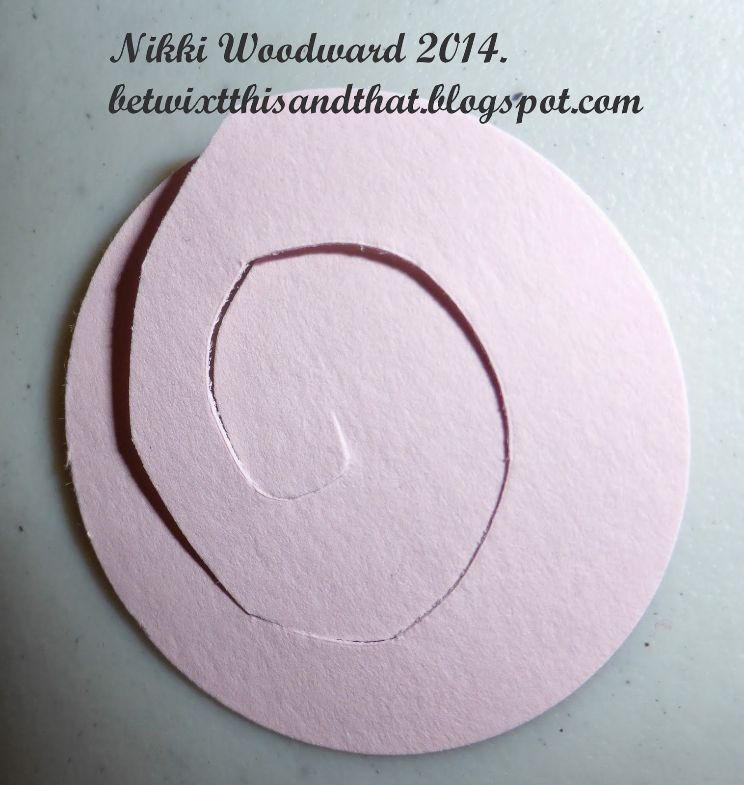
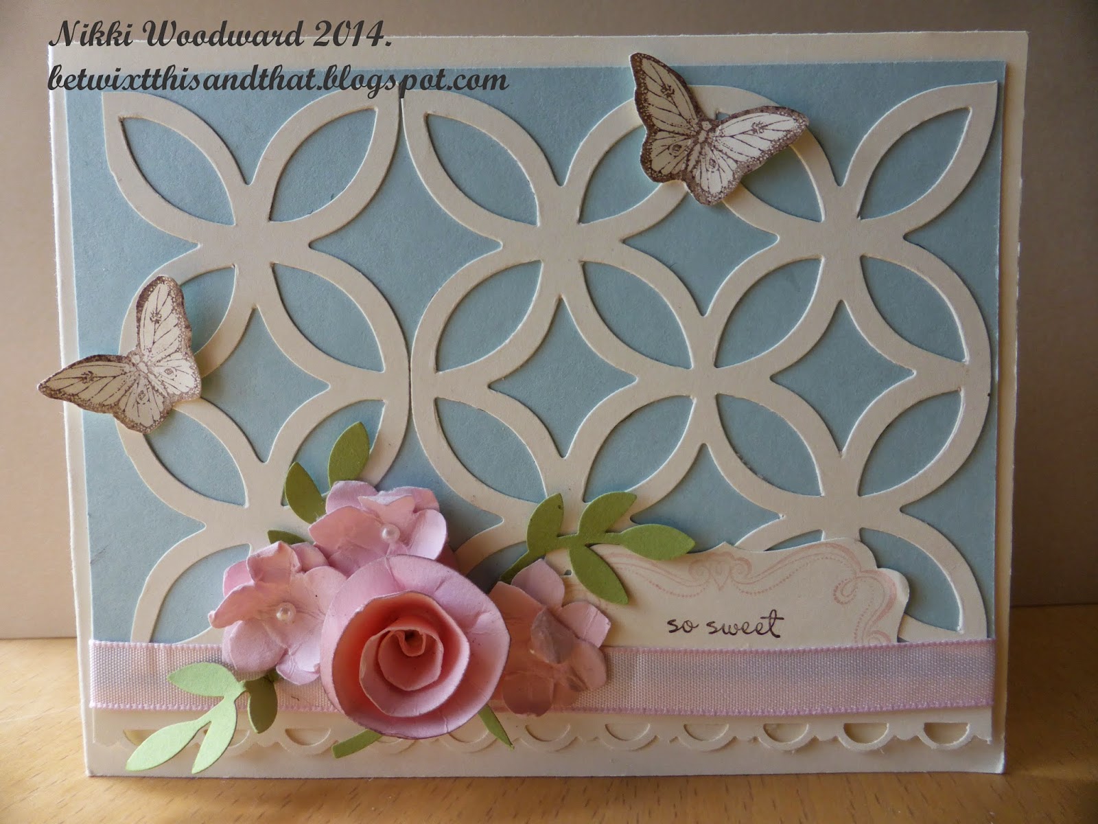 The rolled rose was made by punching a circle from pink cardstock, cutting a spiral and rolling it up. So easy, yet always an original and interesting result. Start from the outside, roll in, keeping what will become the bottom piece flat. The inside (where the spiral cut ends) will form the base of your flower. I use a hot glue gun, put a blob onto a silicon mat and scrape it up with the flower base, then seal it shut.

The little flowers were punched with a flower punched, then rolled and scrunched up to break down the fibres. The top and bottom layer start to separate, then you carefully peal them apart. They give a delicate detail to any flowery project.
The inside of the card was made to be pop up, by using that spare cut off piece from the die cut, mountain and two valley folds. Its always a nice surprise when you open a card to find something fun and interesting inside :)
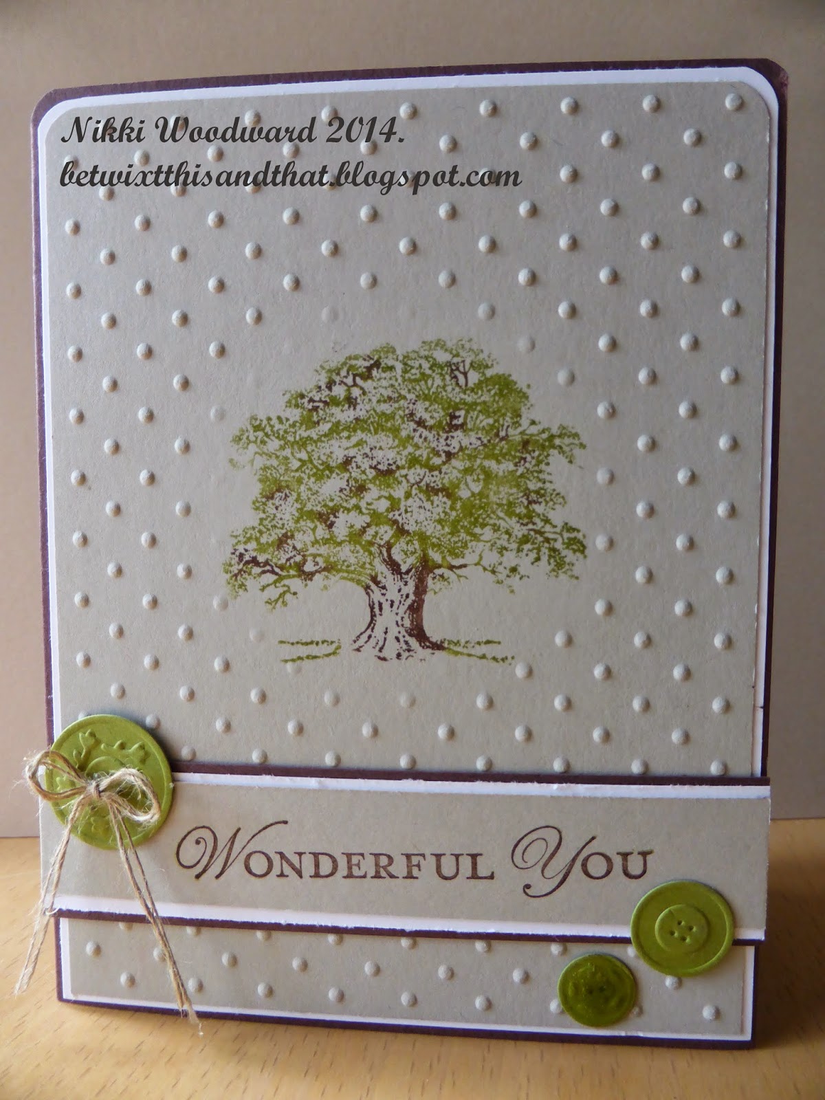
Another project had a more masculine or mature feel, the sahara sand, old olive and chocolate chip worked so well together. The oak tree was colored with markers, the green first, then the brown detail added. Do you notice that the tree is stamped on flat cardstock ? Details of that below ...
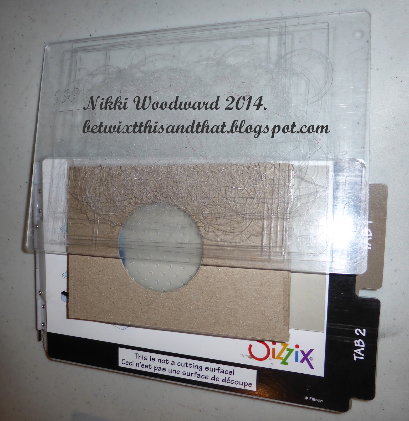
I made my own diffuser, by using two pieces of brown cardstock taped together. A diffuser basically keeps the pressure on or off certain pieces you are embossing. For this card I wanted that circle to be flat, so I made circle cuts in the card. The sandwich for this to work was : Multipurpose platform on all tabs, embossing folder with cardstock inside, diffuser placed on top, then the top acrylic plate. Run through the big shot. Note that is you are ever making your own embossing layers, you need to think about and test how you build your sandwich to get the right amount of pressure.
Hope you learned something, thanks for visiting :)
Tuesday, March 11, 2014
Alternative 70th Birthday Card - SDC 137
Making a card for a funky, bee keeping, alternative guy on his 70th Birthday, and participating in the Stampotique Designers Challenge :) Who says I cant multi task ... lol
I made the textured background flowers from tissue paper. They resemble carnations, but I am thinking lotos fruit, and my favourite lines of poetry sprung to mind .... "And, like a downward smoke, the slender stream. Along the cliff to fall and pause and fall did seem .... (Tennyson, The Lotos-Eaters). Lots of paint, stencilling (notice the honey comb), fussy cutting etc etc. This is the Birthday boy, all relaxed, dreaming in his Lotos-Eaters world .....
I wanted Baby Cthulhu to feature, so stamped him onto shrink plastic and colored with copics. He is simulating a bee ... because after all, this is an imaginary, dreamy kinda world :)
I'd quite like to visit there myself, wanna come ?

I made the textured background flowers from tissue paper. They resemble carnations, but I am thinking lotos fruit, and my favourite lines of poetry sprung to mind .... "And, like a downward smoke, the slender stream. Along the cliff to fall and pause and fall did seem .... (Tennyson, The Lotos-Eaters). Lots of paint, stencilling (notice the honey comb), fussy cutting etc etc. This is the Birthday boy, all relaxed, dreaming in his Lotos-Eaters world .....
I wanted Baby Cthulhu to feature, so stamped him onto shrink plastic and colored with copics. He is simulating a bee ... because after all, this is an imaginary, dreamy kinda world :)
I'd quite like to visit there myself, wanna come ?
Thursday, March 6, 2014
Freedom to Sing journal page
I was fortunate enough to encounter Karen from Southern Ridge Trading Company at a craft event recently, and spent time looking through her baskets of wonderful-ness, various wooden and chipboard die cuts in all shapes and sizes, some delicate and intricate, others more sturdy - it was exciting.
One little bird caught my eye. He was bagged up with his little friends but was desperate to feature in my next art journal page, so I enabled him ! lol

Here is a close up of the right side of the page :

The inspiration for this page came from a poem I had recently read about acceptance, and in particular accepting ourselves for who we are. Unfortunately I didn't note the authors name of this poem. I would like to think we all have the freedom to sing and simply 'be'. This bird was perfect, he looks confident and was the perfect size.
The background is made from a Donna Salazar Designs paperpack called Fun & Funky, I was loving the chicken wire. The torn pieces were glued into my Moleskin art journal with gel medium and I coated the pages so that I could go in with my Faber Castell Big Brush pen to add some depth and shading to the background. I whitened the edge of the page with white acrylic paint. The whimsical birdcage is from a Prima stamp set. I stamped the words using an Image Tree alphabet stamp set and applied a washi tape musical road for my bird.
A close up of my bird :

He is quite thick, sturdy chipboard. I put a layer of clear gesso onto him to get a little tooth for my gelato's and so I could work with a wet medium. I colored him with chocolate, butterscotch and tangerine gelato, and used my aqua painter to blend and move the colors around. As you can see, he has red lips /beak.... yes, he is a very fortunate whimsical bird. lol. A couple of layers of clear embossing powder put the finishing touches to his appearance. Isn't he cute.
Your instructions for today ... go forth, sing and be you - everyone else is already taken.
Nikki x
Stampotique February atc swap
The Stampotique girls were keen to go again with the atc swaps, so I organised another, entitled 'Outside the Box'. I am loving these exchanges so much, I hope it goes on forever ...
My interpretation of the title 'Outside the box' was that Mothloved is feeling left out, she is a square peg in a round hole, feeling a bit insecure. Also, the tab protruding from the side of the atc is on the left, 'left out' - get it ?
I randomly clear gesso'd my water color paper, let it dry, then colored onto my craft mat with a blue and purple gelato, spritzed with water and 'smooshed' (is that a word? LOL) my paper through the mixture. I went in afterwards and did some more specific painting and applied a little contrasting ocre. The texture of the paper turned out amazing, it was scratchy and abstract. The ungesso'd areas are darker. I stamped Mothloved and embossed her, then painted white acrylic over her body parts and spots on her dress. I painted her tshirt purple. The edge was lightly sponged with black soot distress ink.
The tab was punched with my envelope punch board and 'left out' stamped. I love the contrast between the smooth shiny embossing and the gritty background.
 I always decorate the back of my atc's. If I spend that long planning and executing the front, then I want the back to be just as great. Painting and a little second generation stamping make the perfect atc back.
 The atc was sent to the UK, the recipient LOVED it :) Result ....
My interpretation of the title 'Outside the box' was that Mothloved is feeling left out, she is a square peg in a round hole, feeling a bit insecure. Also, the tab protruding from the side of the atc is on the left, 'left out' - get it ?
I randomly clear gesso'd my water color paper, let it dry, then colored onto my craft mat with a blue and purple gelato, spritzed with water and 'smooshed' (is that a word? LOL) my paper through the mixture. I went in afterwards and did some more specific painting and applied a little contrasting ocre. The texture of the paper turned out amazing, it was scratchy and abstract. The ungesso'd areas are darker. I stamped Mothloved and embossed her, then painted white acrylic over her body parts and spots on her dress. I painted her tshirt purple. The edge was lightly sponged with black soot distress ink.
The tab was punched with my envelope punch board and 'left out' stamped. I love the contrast between the smooth shiny embossing and the gritty background.
Designs By Ryn Celtic Bird
A new stamp to my ever growing (house groaning under the weight) stamp collection, is a beautiful set from Designs by Ryn. I loved working with it, and made a cute card for my card box. The background is sprays from Dylusions and Lindys Stamp Gang onto water color paper. I stamped the bird with black versamark and embossed with clear embossing powder. I colored the bird in with my signo white gel pen. Its subtle, but quite special. A hero art flower stamp in the background, using pale green ink to keep it subtle. I wrote the sentiment, and used clear pops to embellish.
 Published on Ryn's blog :
http://www.designsbyryn.blogspot.ca/2014/03/customer-gallery-10.html
http://www.designsbyryn.blogspot.ca/2014/03/customer-gallery-10.html
Retreat and bead making ...
One of the projects I did this weekend was to cover a gift box for cards. Quite liked the front of the box, but LOVED the beads. So easy, so much fun and so amazing and durable. Thank you to JenniBelli for her youtube tuition. Beads are just long strips of tapered patterned paper. Start to roll the widest end first, to the smallest. I applied a bit of glue along the way to keep it from unravelling, but the whole bead is coated with a couple of coats of clear nail polish. Fab, or what ....

Sunday, March 2, 2014
The future looks bright
A chance encounter has lead to an exciting opportunity for me.
I met Karen, who runs an amazing company selling chipboard and wooden shapes. Her items are so beautiful and many of them so finely detailed, I have never seen anything like it. The possibilities are endless with these little beauties, and as a fellow crafter I'm sure you will understand : I just HAD to have some of them ..... lol
After working with them, a horse shoe and adorable little bird, Karen asked me if I would join her design team. I thought about it, for maybe a nano second and said yes :)
I am very excited to be part of this new business venture. Stay tuned for some yummyness and inspiration .....
Check out the store and blog. Both have a fairly new web presence and are being populated bit by bit, so maybe you'll just have to keep checking back for more :)
http://www.southernridge.net/
http://southernchipboard.
Have a great day x
I met Karen, who runs an amazing company selling chipboard and wooden shapes. Her items are so beautiful and many of them so finely detailed, I have never seen anything like it. The possibilities are endless with these little beauties, and as a fellow crafter I'm sure you will understand : I just HAD to have some of them ..... lol
After working with them, a horse shoe and adorable little bird, Karen asked me if I would join her design team. I thought about it, for maybe a nano second and said yes :)
I am very excited to be part of this new business venture. Stay tuned for some yummyness and inspiration .....
Check out the store and blog. Both have a fairly new web presence and are being populated bit by bit, so maybe you'll just have to keep checking back for more :)
http://www.southernridge.net/
http://southernchipboard.
Have a great day x
Subscribe to:
Posts (Atom)